BURGER:
A no-nonsense identity for a no-nonsense brand.


With operations in Edinburgh, St Andrew’s and Newcastle, BURGER’s offering is simple. Great burgers. That’s it.
Project summary
Strategy
Design
Art-direction
Copywriting
Campaign
Visual identity
Website
POS
Approach
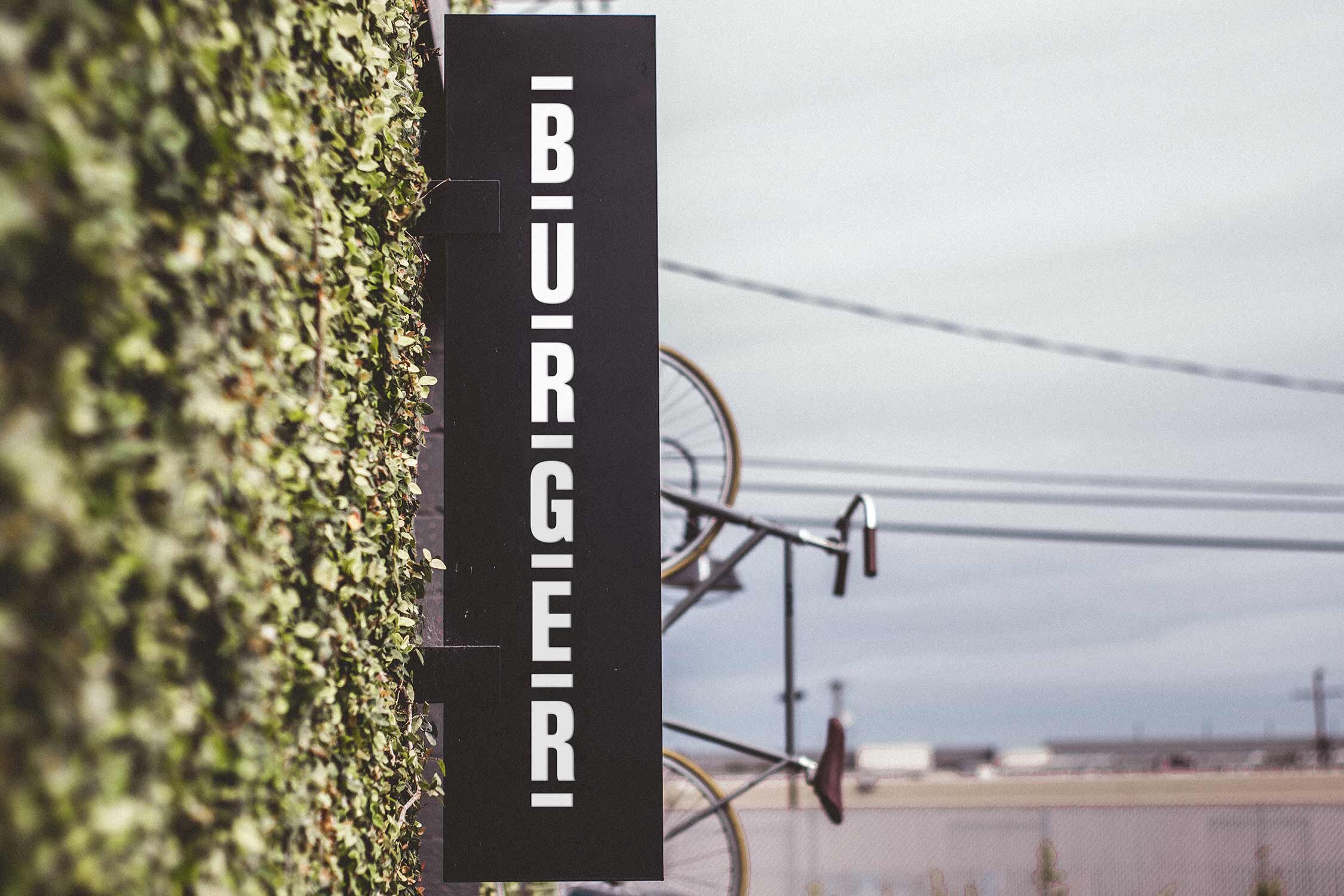
The name called for a no-nonsense approach and we began brand development with some stripped-back typography.
Leading unapologetically with ‘BURGER’ created a sense of ownership over the word in a competitive space. With origins in woodblock printing, the Block Gothic font had the right overtones of craft and robustness. A simple word-mark can condense to a ‘bun’ in its simplest form, and expand horizontally or vertically to let the name do the talking.
We wanted the identity to feel universal in its colours and styling. Structural, functional and deliberately unembellished, the branding keeps the focus on the food.
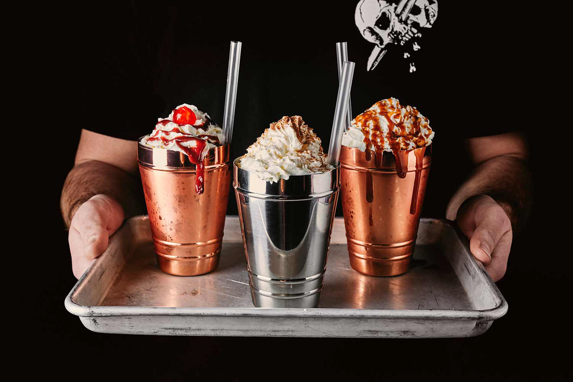
Scale and deployment are important factors in this brand’s impact, with copy amplifying its voice. Flexible, loud and enjoyably teasing, its intensity provokes the right response.
Against a monochrome palette, bright oversaturated photography communicates the intense, messy pleasure of a good burger.