Fraher:
A concept based on the visual language of architecture.

Fraher Architects print materials designed by Freytag Anderson
Fraher Architects logo
Fraher architects asked us to design for them a visual identity which communicates both their adaptable approach and creative principles. fraher.co
Project summary
Strategy
Corporate identity
Art-direction
Print
Website
Approach
We created a logo based on the plan view of the letter F. The intersecting compartments create a simple yet distinct graphic device for containing text, images and texture.
The 'F' marque's shape and proportions are defined by the format, thereby creating a flexible and dynamic identity system. A variety of line weights and styles combined with the red signature colour add further interest and dimension.
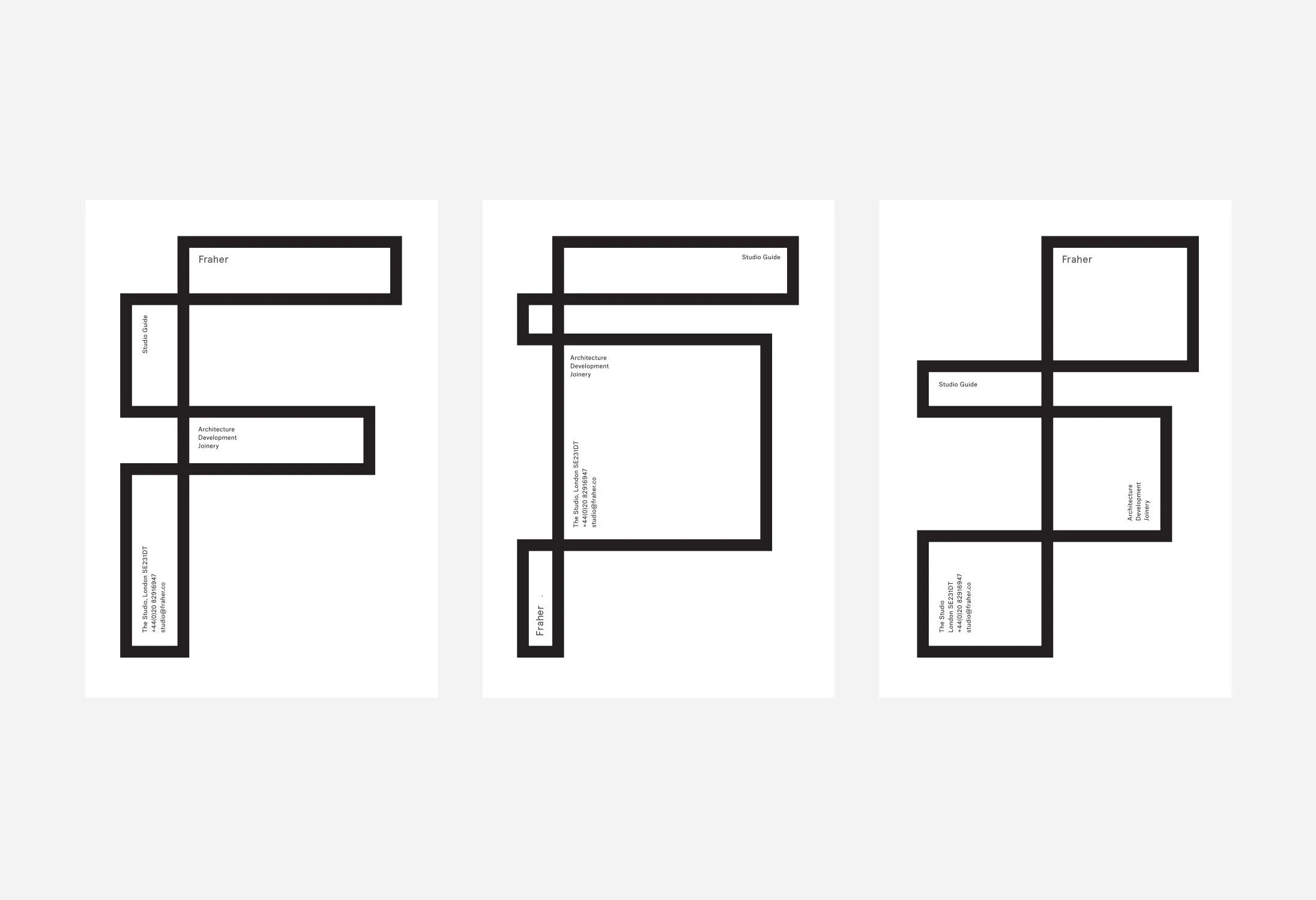
Studio guide document variations

Business card design
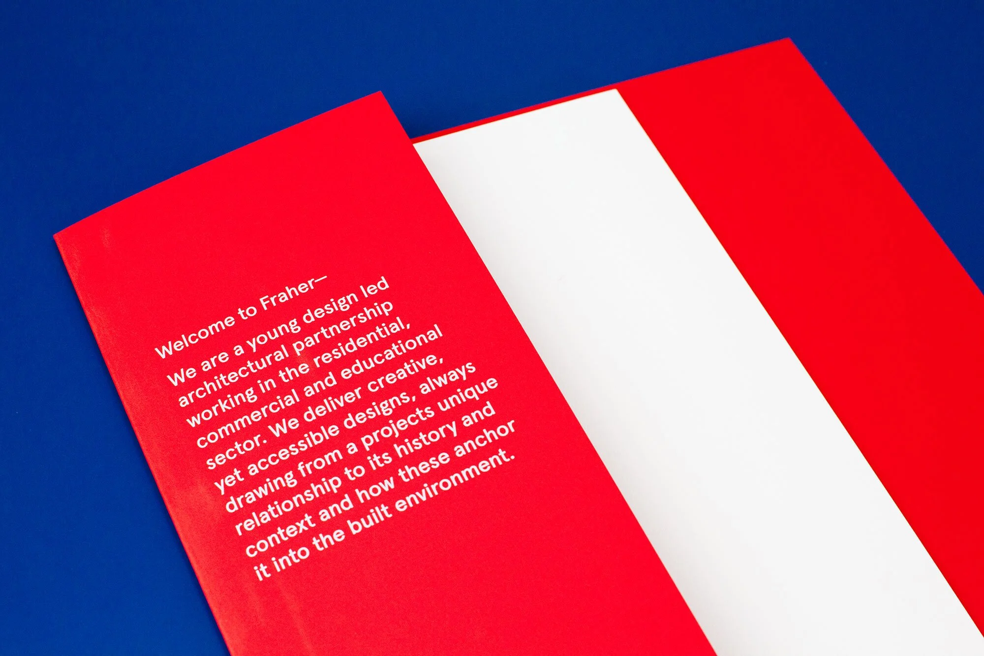
Brochure design by Freytag Anderson

Interior building wall with Fraher Architect logo showing information about building
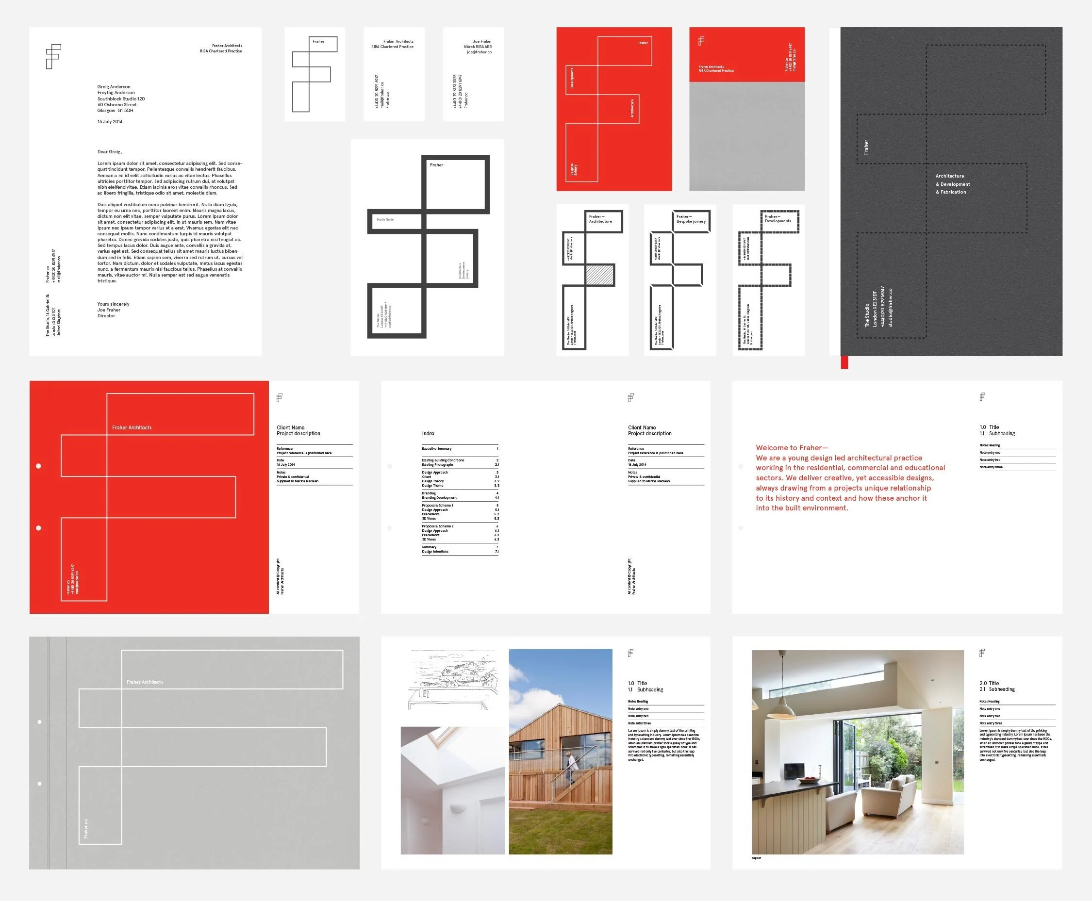

Branding guidelines created by Freytag Anderson
Skylight view with light and cables that cross over

Fraher Architects portfolio design

Website mockup of Fraher Architects
Typography guidelines for Fraher Architects

Logo guidelines