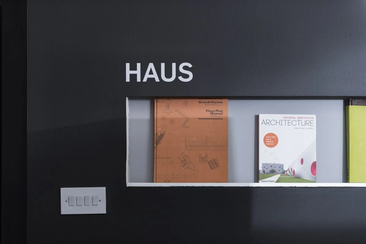
HAUS Architects:
A brutalist design brief becomes a playful brand identity based on contrasts.
Awards:
Corporate identity SDA 2018
Chairmans award SDA 2018

Established architectural consultancy HAUS asked us to create a new brand with a minimalist aesthetic. It had to project the confidence, logic and scale of the practice. haus-collective.com
Project summary
Strategy
Art-direction
Corporate identity
Website
Print
Approach
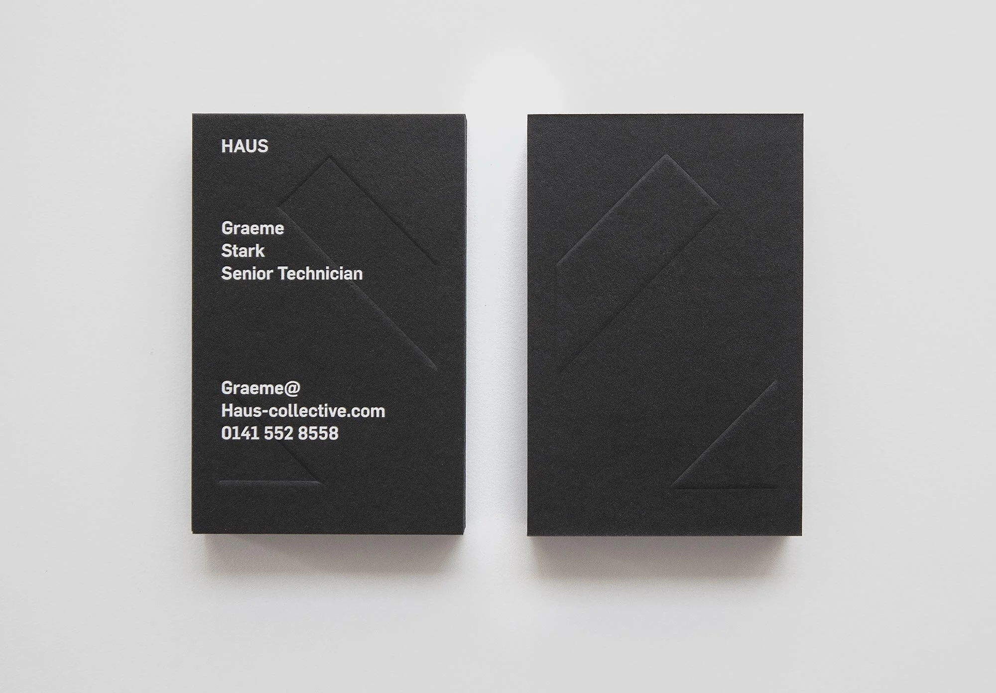
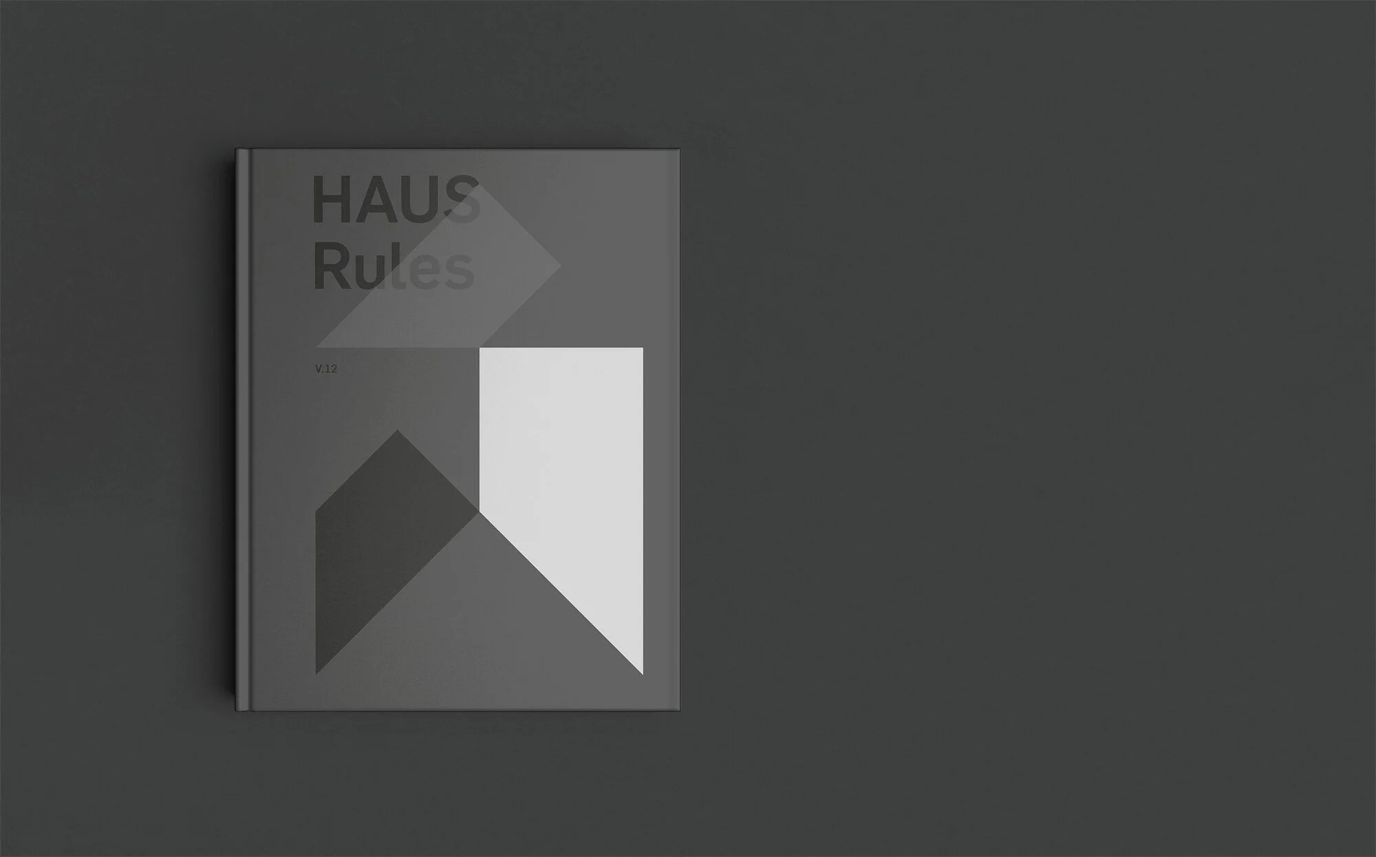
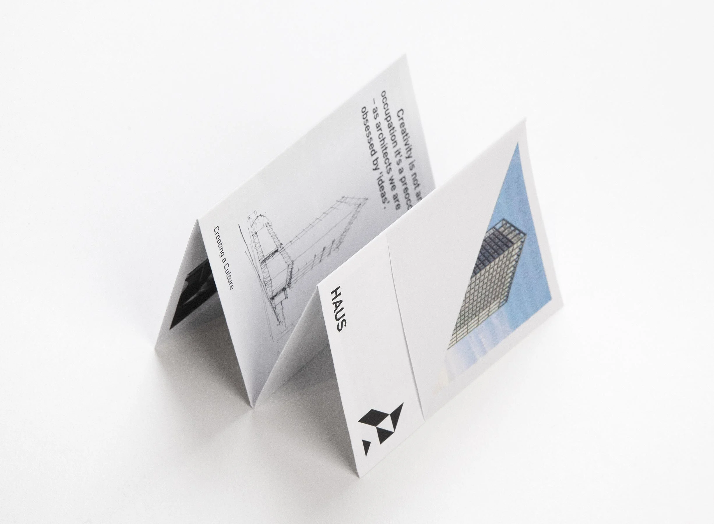
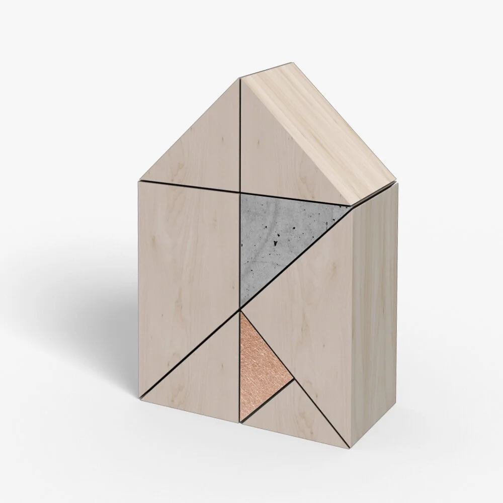
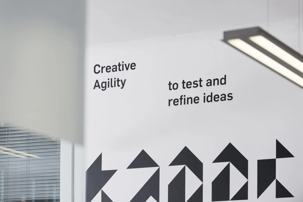
The firm's name evolved into an icon: an almost childlike rendering of a house, universally recognisable at the most subliminal level.
Inspired by the structure of the traditional fachwerkhaus, we broke this icon into modular units which could combine and recombine. In a monochrome palette, these shapes become distinctive representations of the brand.
Constant variation tempers their minimalism, and suggests the professional ingenuity of the practice. The lines of traditional German timbering hint at craft, but maintain a brutalist edge.
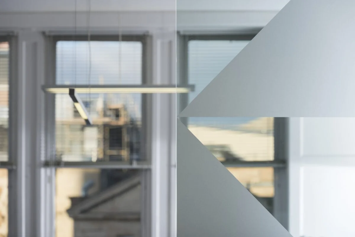
Iconography and text collide playfully in applications of the brand, with overlays and size variations held together by a robust grid system. A spatial identity: The icon has exciting potential for 3D manifestation: from small art objects to installations in the physical environment.