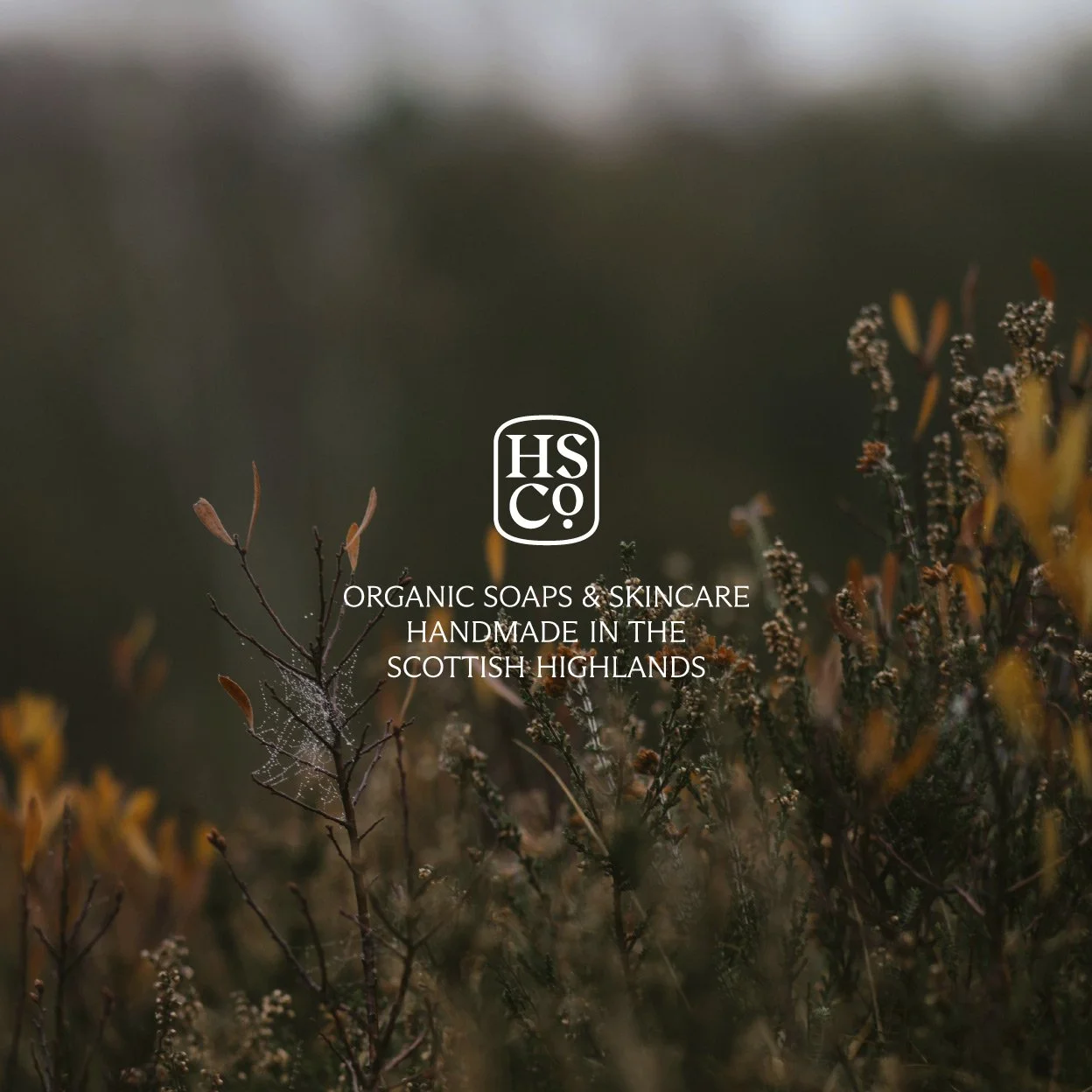
Highland Soap Co.
Scope:
Strategy
Visual Identity
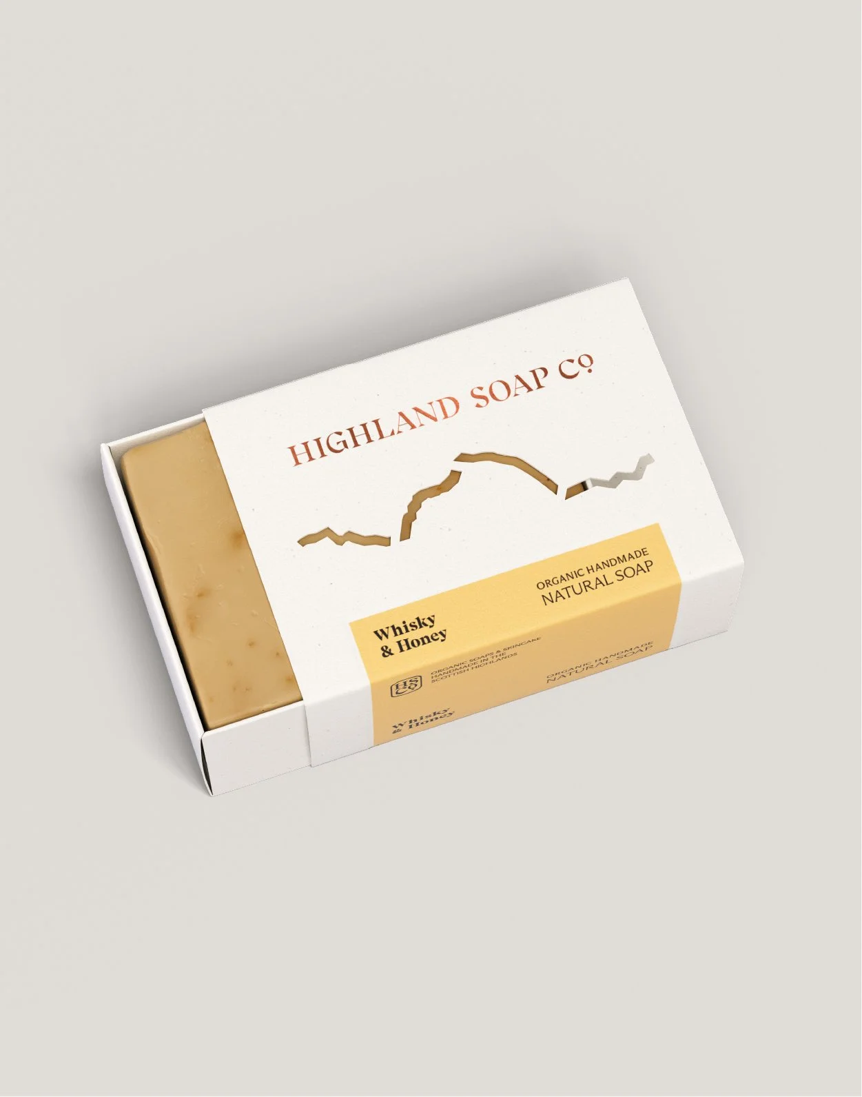
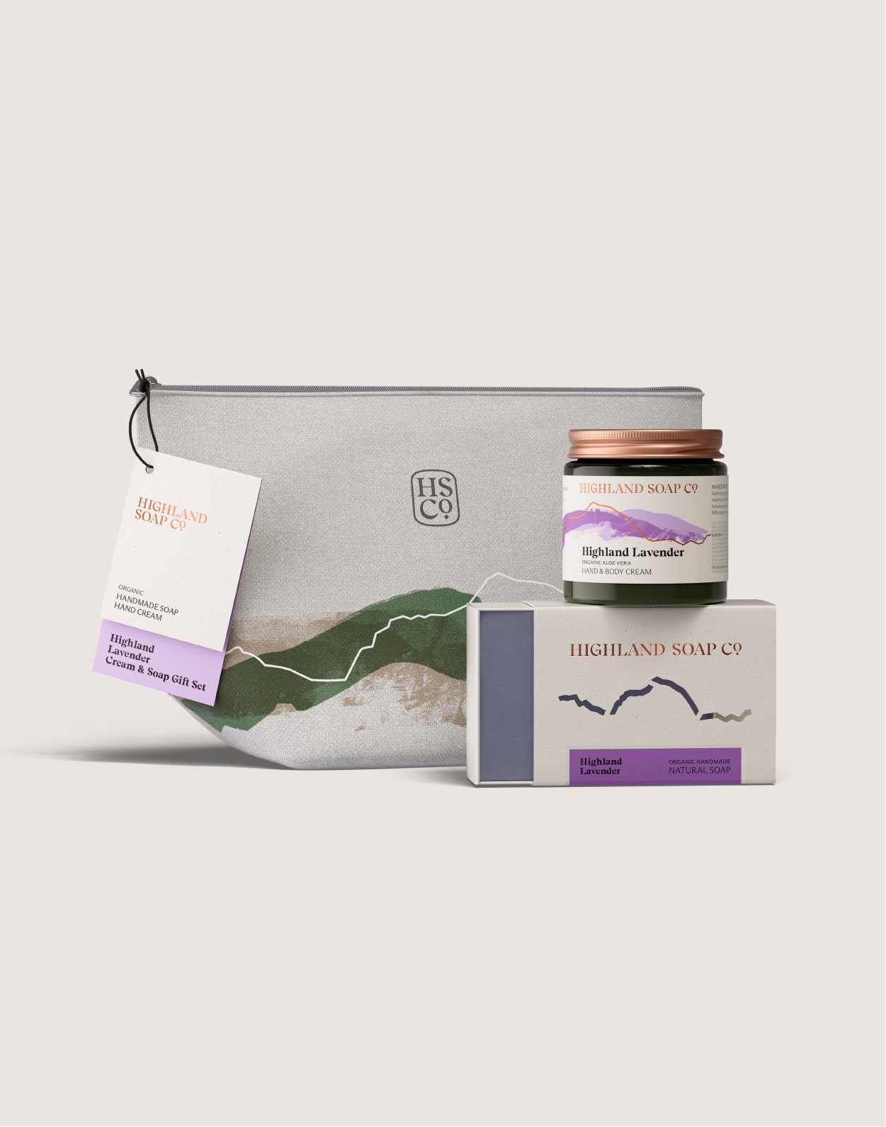
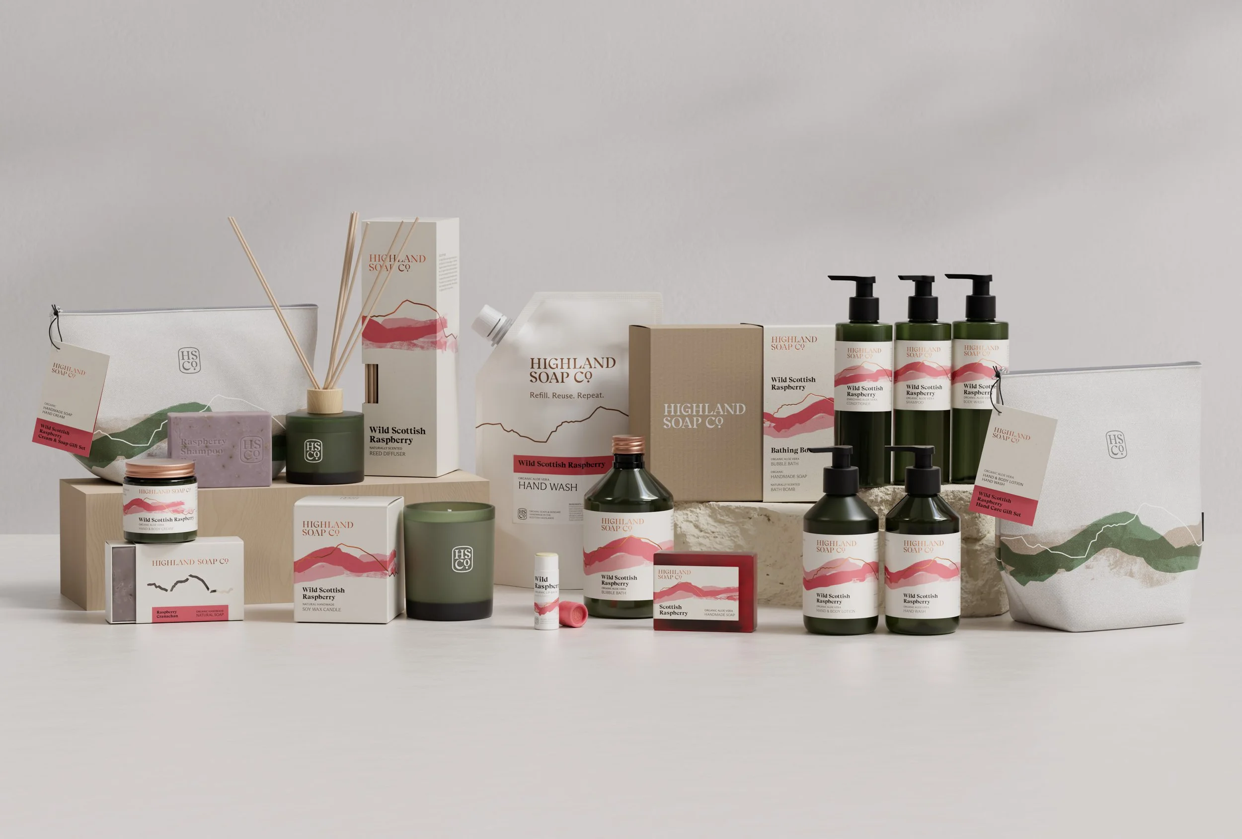
Packaging
POS
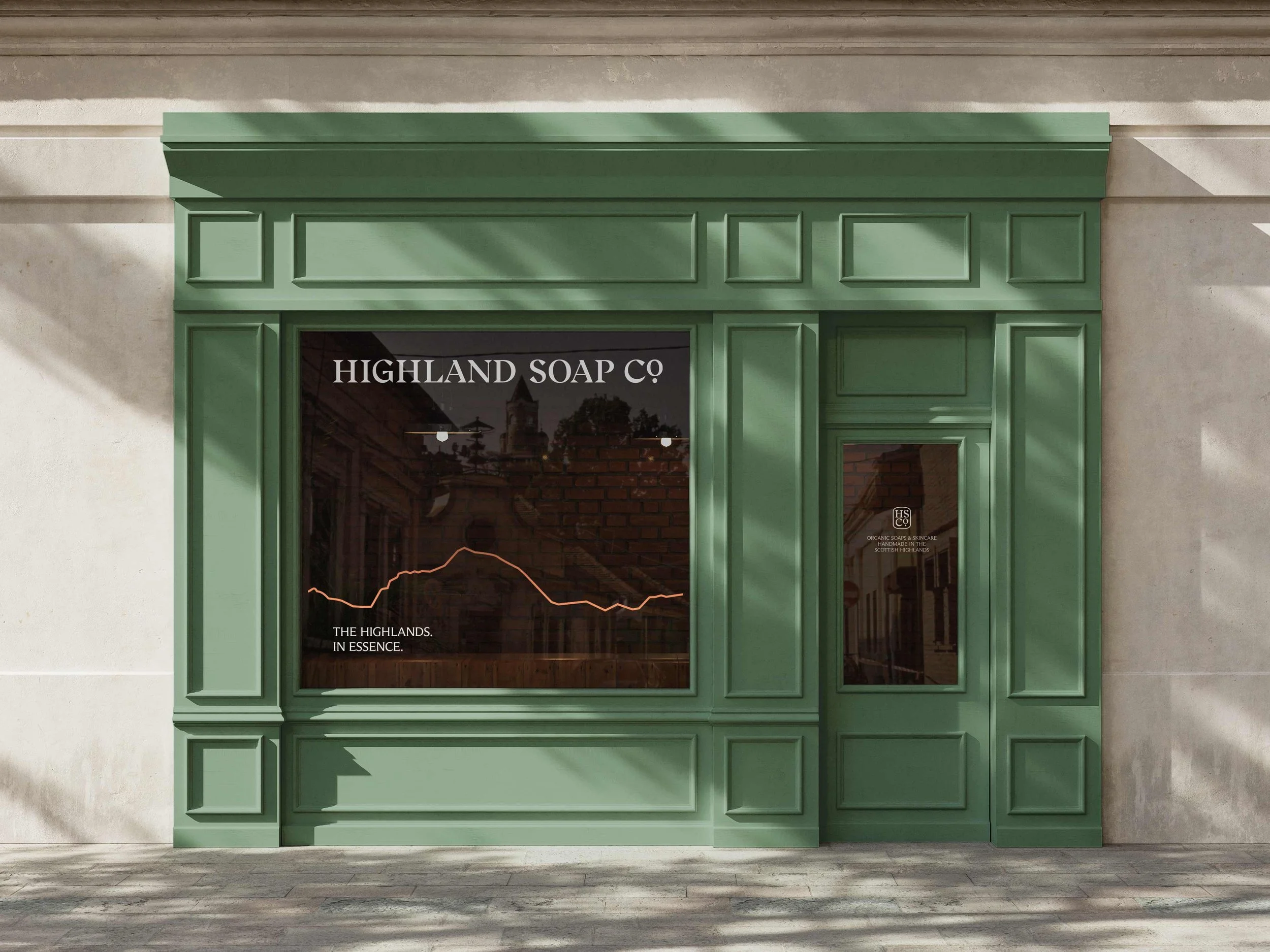
Signage
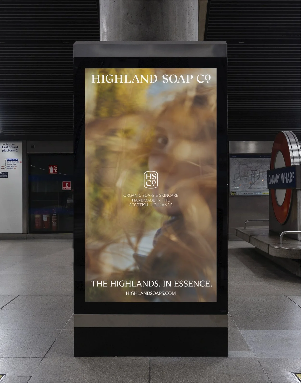
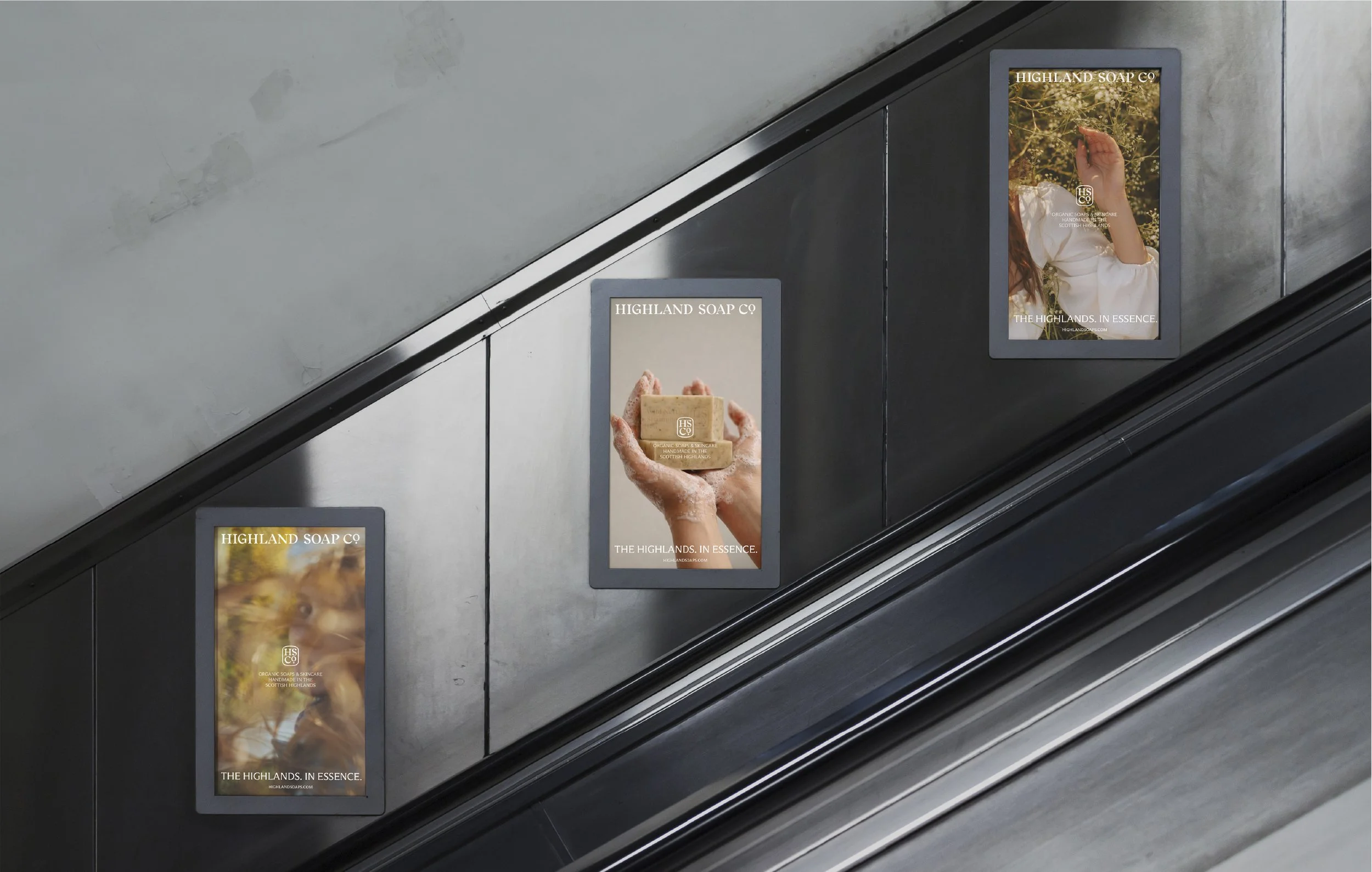
Digital
Motion
Credits:
Photography / Murray Orr
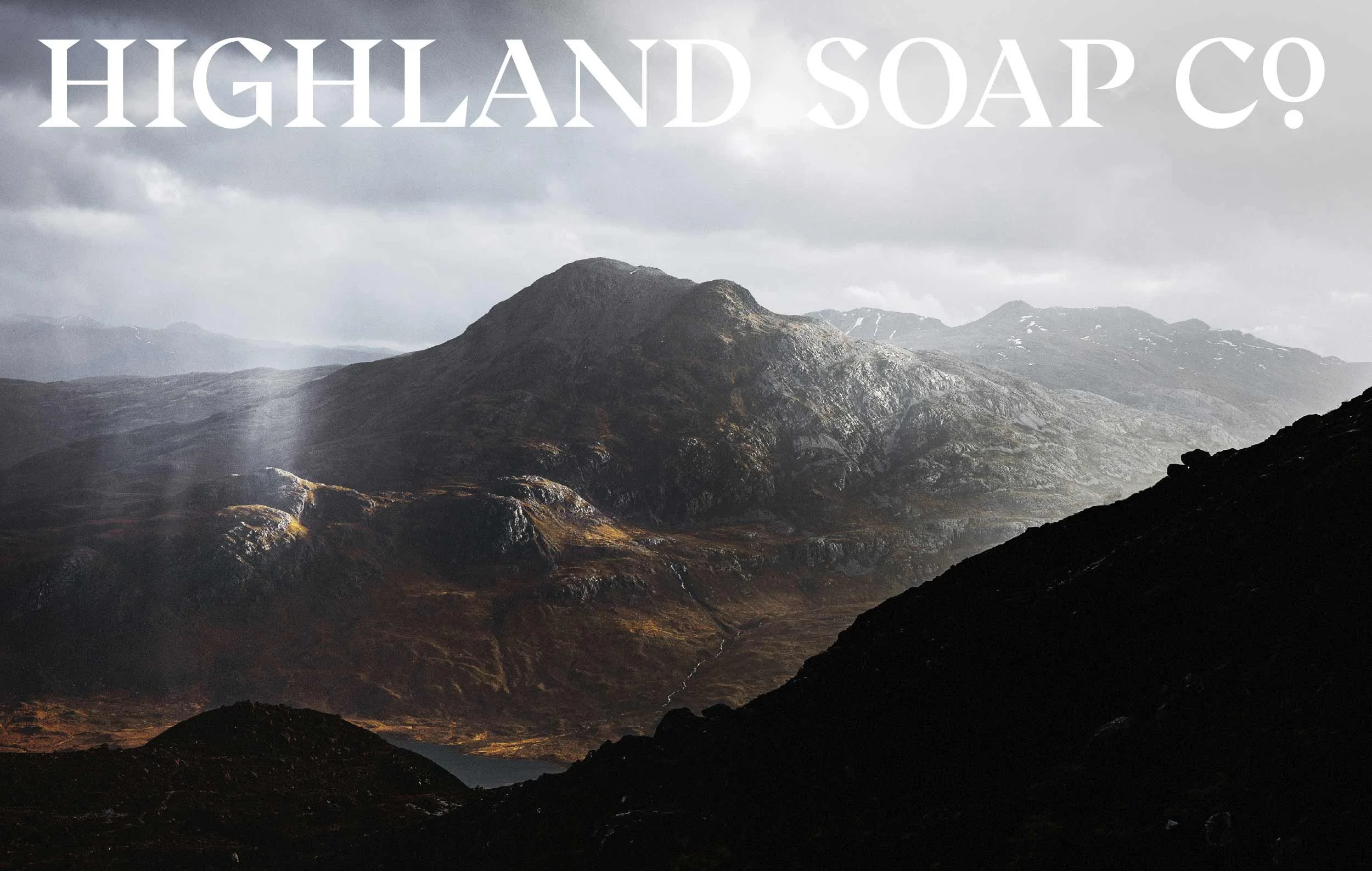
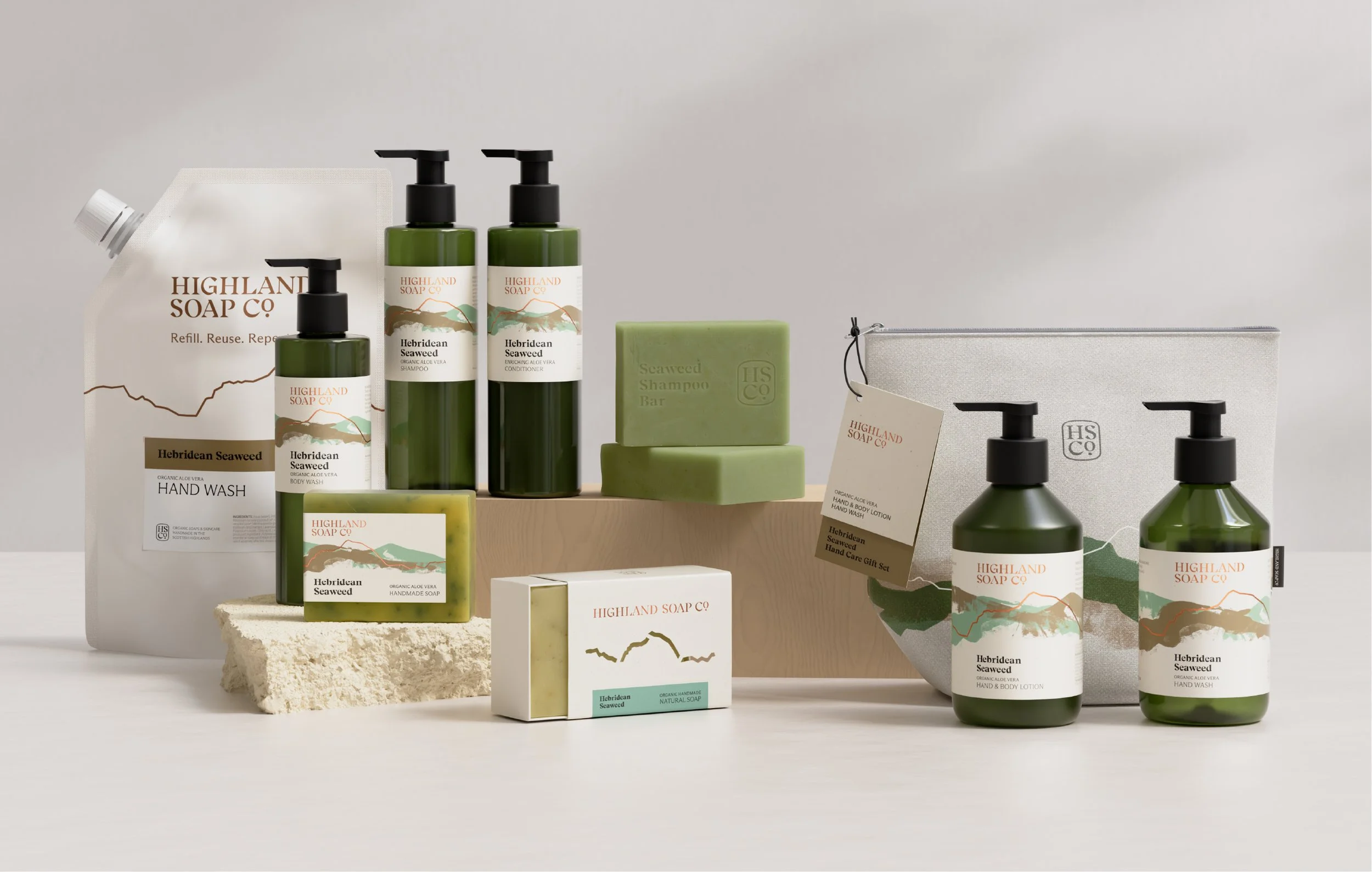
The first major rebrand in more than 30 years for The Highland Soap Company, creating a calmer, more confident identity rooted in place, craft and clarity.
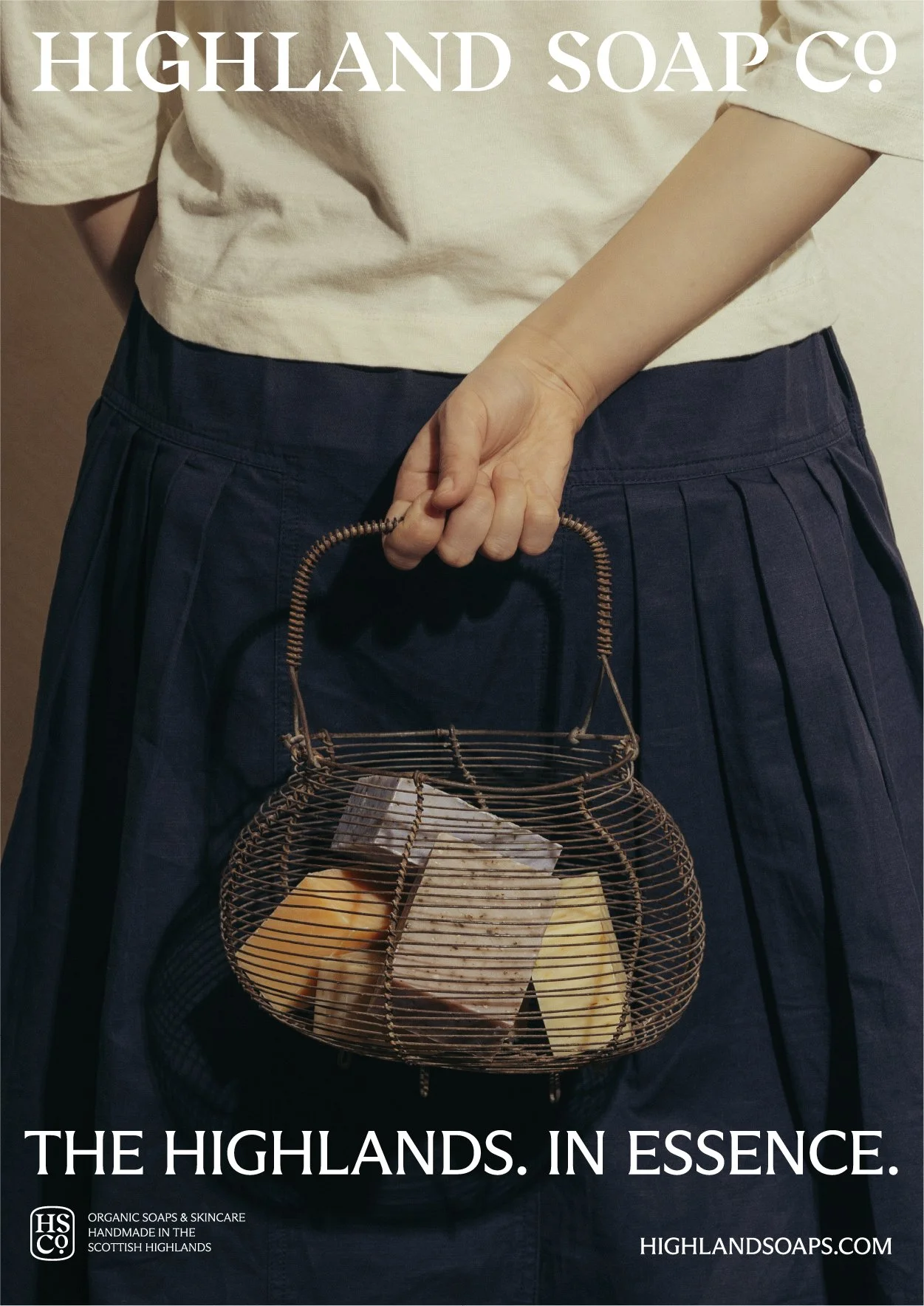
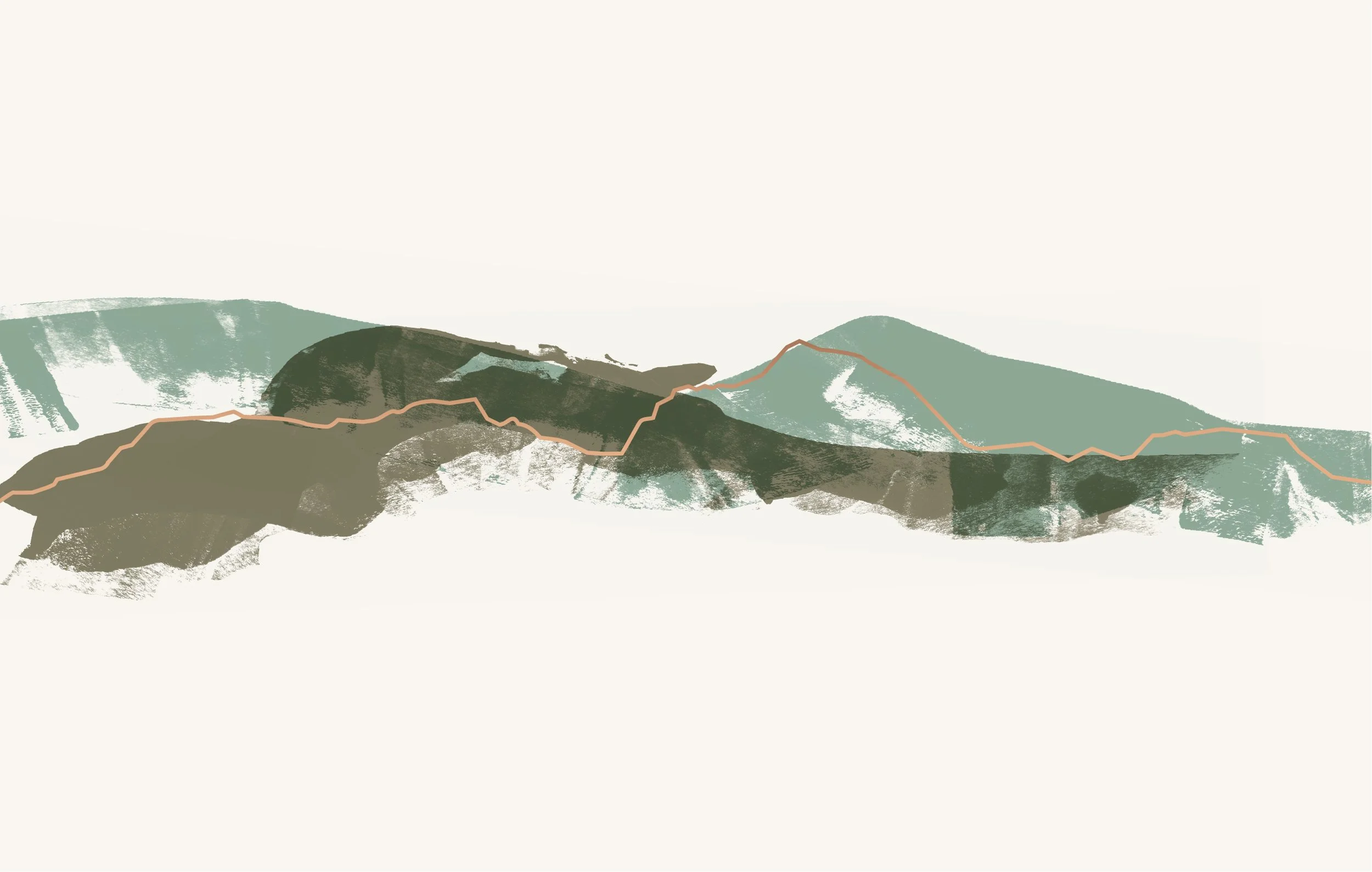
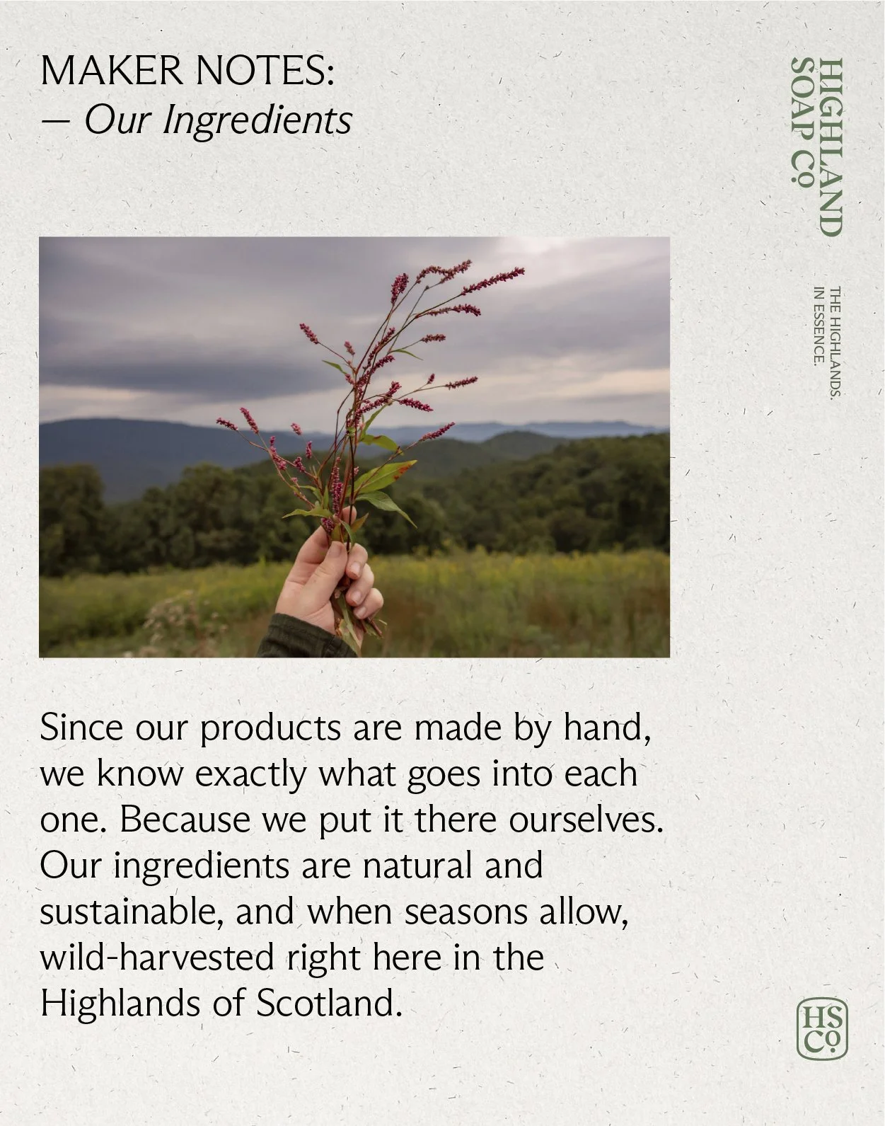
Built around the positioning line The Highlands. In Essence. - the rebrand draws from the landscape surrounding the company’s Fort William workshop, with a bespoke skyline motif, natural palette and hand-painted ink textures that reflect the handmade nature of the products.
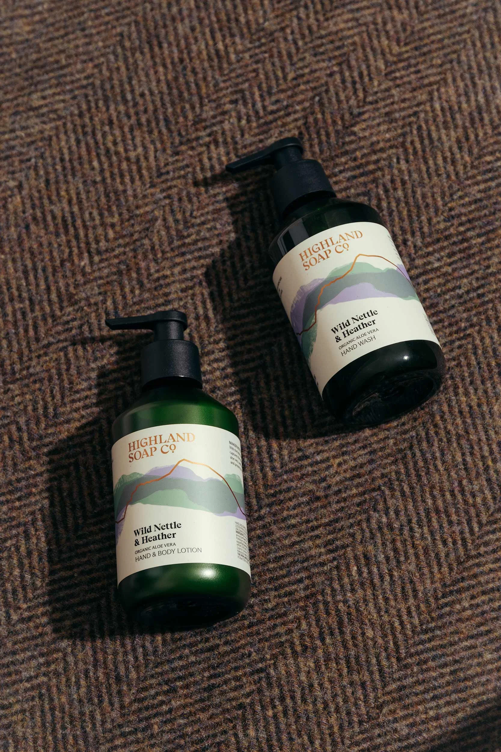
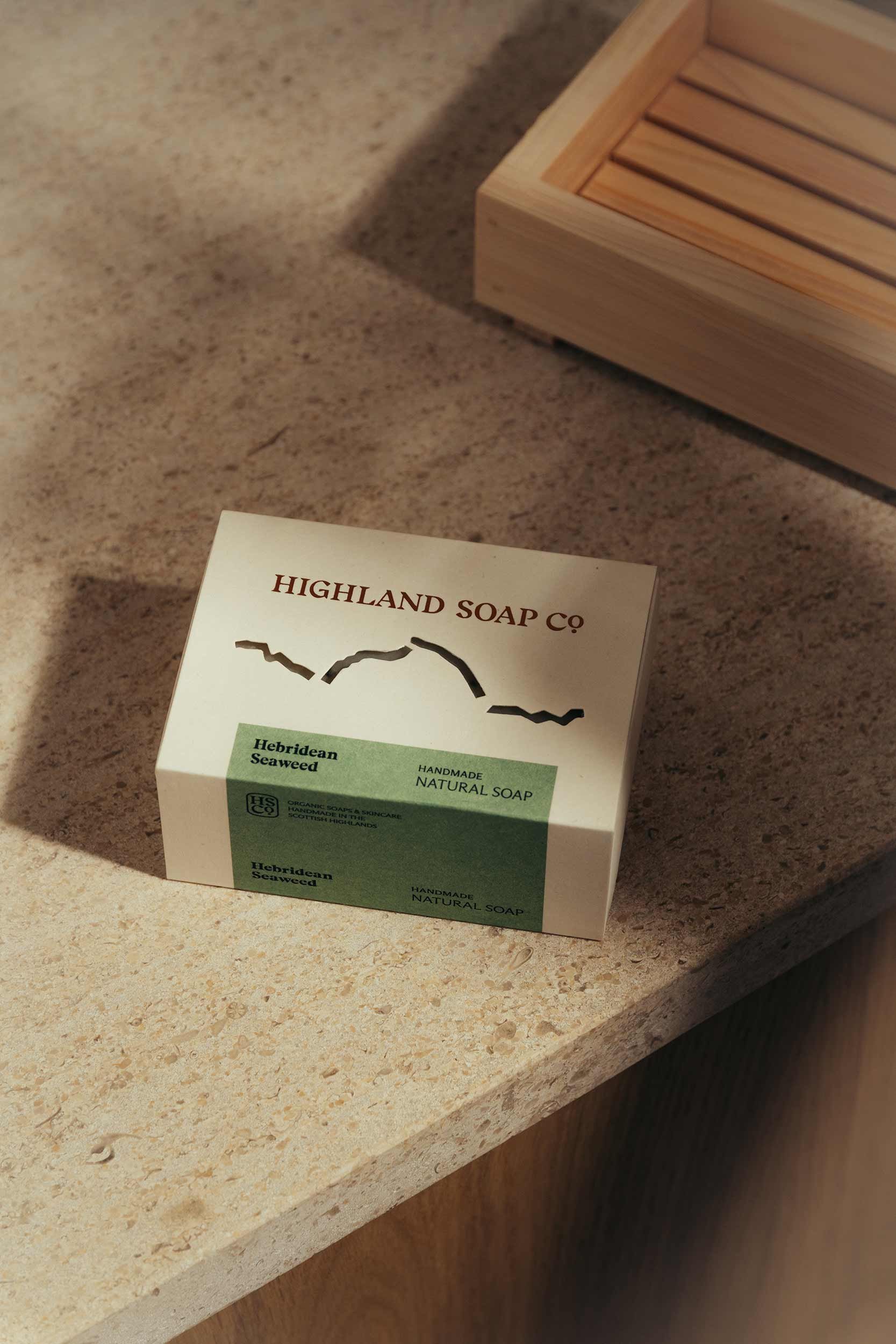
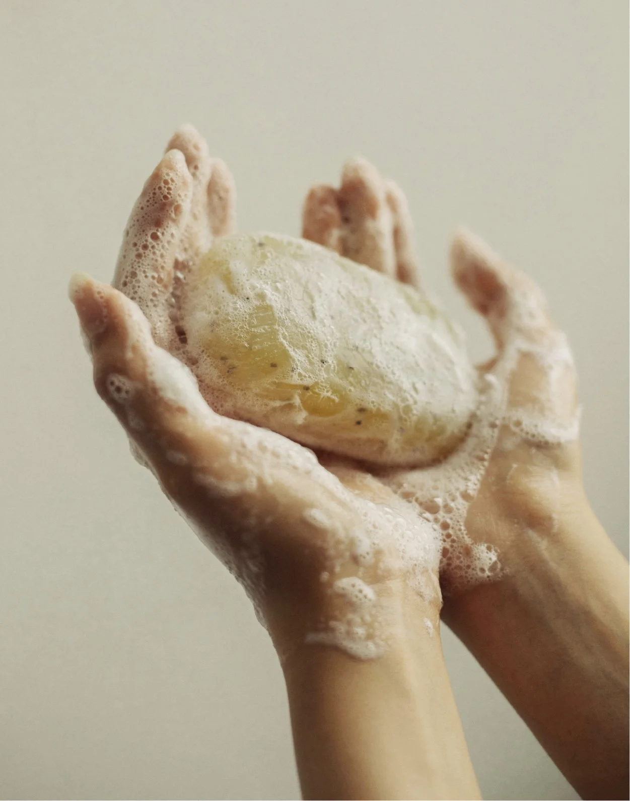
Alongside a refined visual identity, the packaging system was rethought to improve navigation, clarity and shelf presence through bespoke green vessels, new forms and expanded label space. The result is a contemporary brand designed to stay true to its Highland origins while broadening its appeal to a wider UK audience.