SEC:
Rebranding Scotland’s foremost event destination.

SEC logo over an image of a band playing a set
After 30 years, the Scottish Exhibition and Conference Centre rebrands to Scottish Event Campus (SEC), projecting the collection of venues as one impressive site for major events in Scotland.
Project summary
Strategy
Design
Corporate Identity
Art-direction
Website
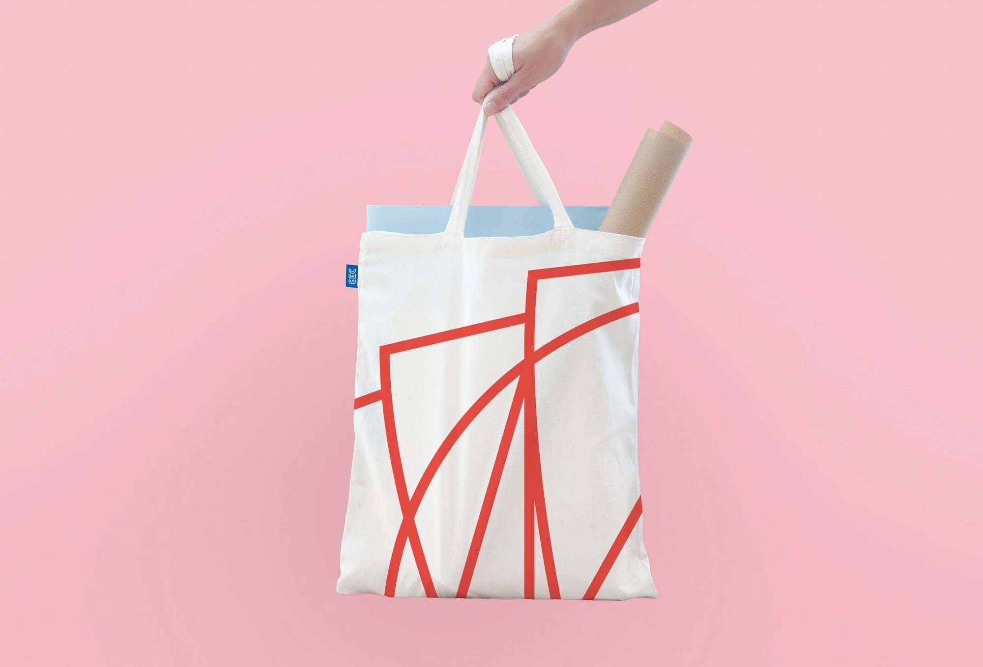
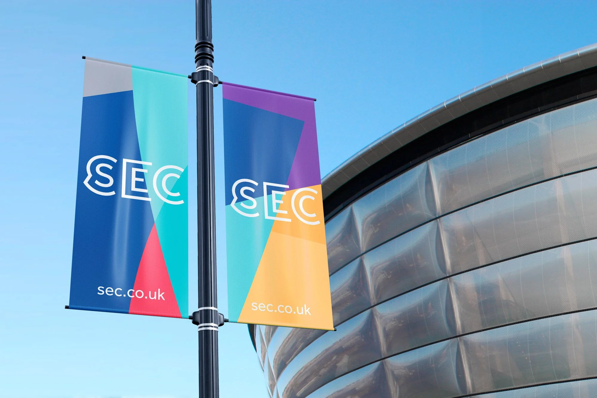
Print
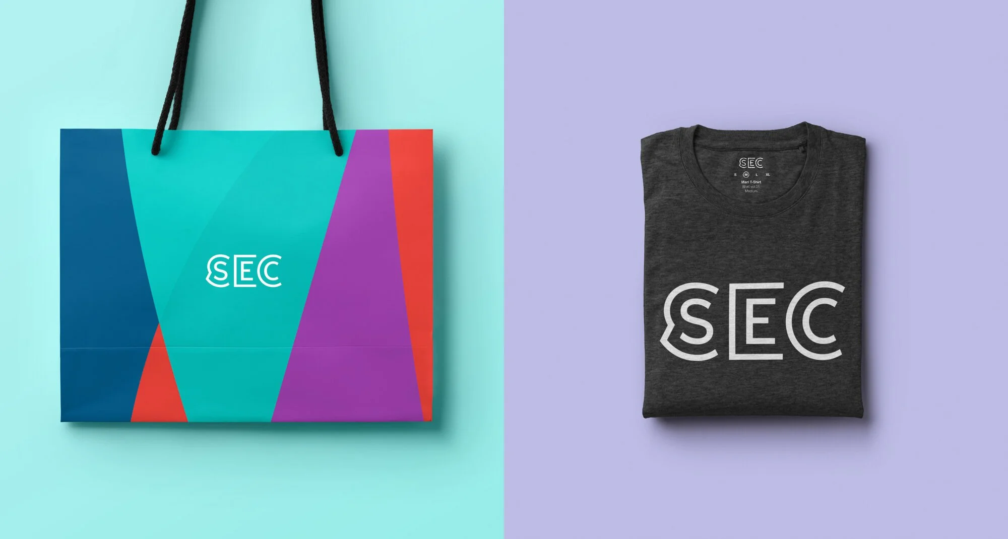
Merchandise
Approach
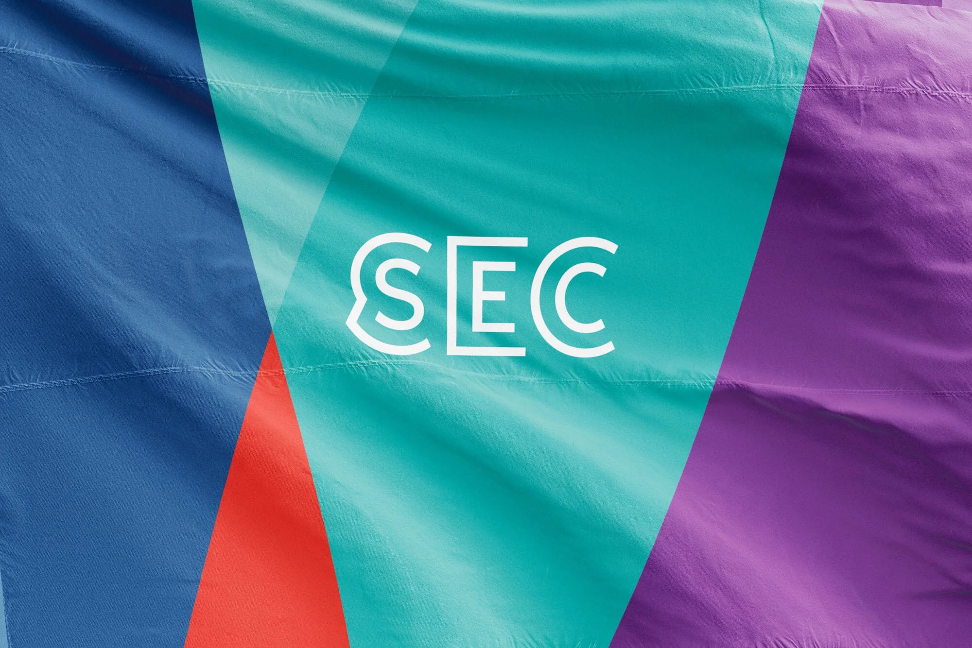
The new brand is based around the idea of encapsulation. The three buildings, including two iconic structures by Foster & Partners, are brought together under one marque that represents their significance and shared location on the Clydeside.
The identity utilises shape and pattern applied across print, screen and environment, inspired by the venues’ architecture.
A distinctive colour palette represents SEC’s income-generating divisions, supporting their international sales development and strengthening the campus’ national significance.

Geometric image of the SEC, Scotland

Grayscale image of SEC’s roof, Scotland

Side view of SEC Glasgow
Black and white logo of SEC by Freytag Anderson

Band playing at the SEC Glasgow


Project team
Motion graphics: The Forest of Black
Client comments
"FA creatively delivered what I consider to be an extremely intelligent response to what was a very complex and challenging brief. I was keen that we didn’t have a marque that was of the moment and that could speak to various market segments – business to business and consumer markets – and would take our business into the future. The brand launched at the V&A London in January 2017 along with a new website and brand assets that will continue to be rolled out in the coming weeks."
Sean Murray
Head of Marketing, SEC