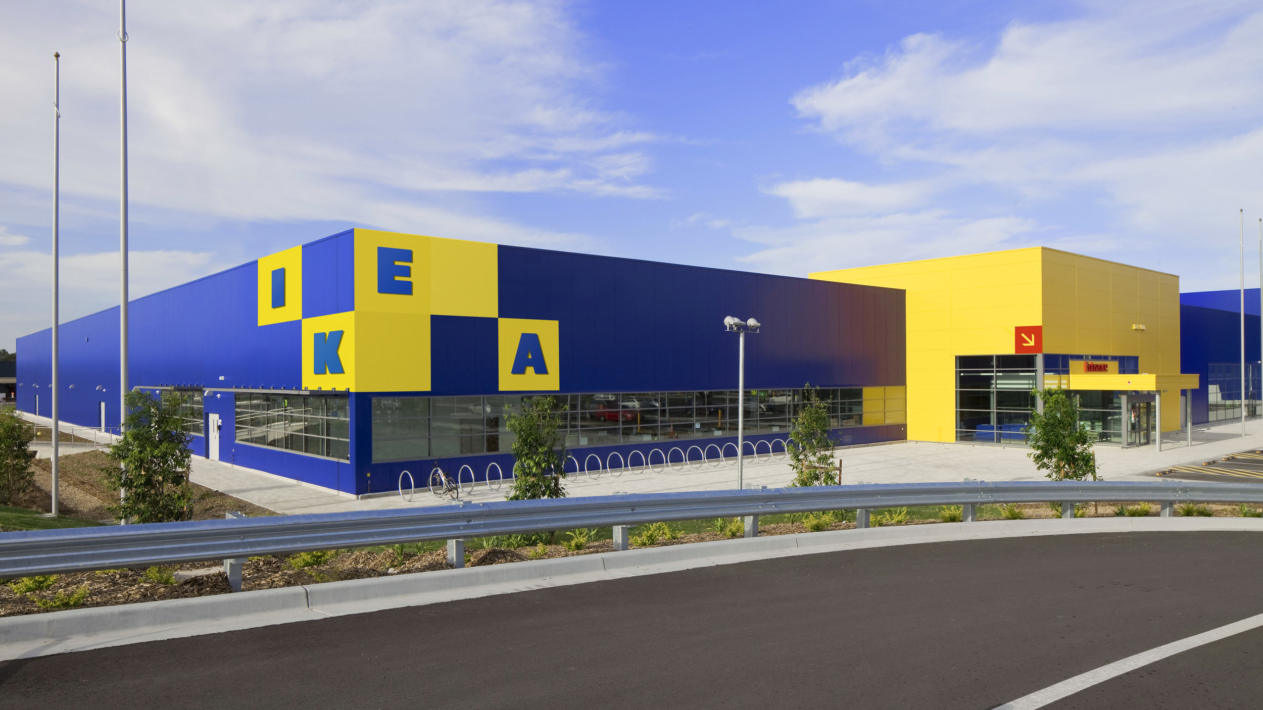
ICON Re:Think IKEA
A stackable identity concept for the worlds largest furniture retailer.
ICON Magazine asked us to Re:Think a current brand. We chose Swedish furniture giant IKEA.
Project summary
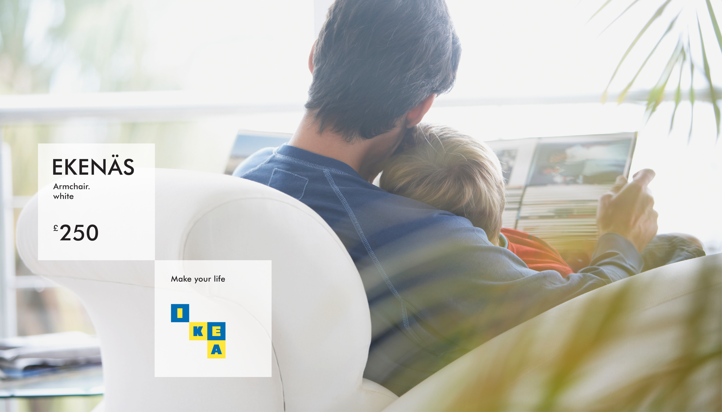
Corporate identity
Packaging
Signage
Livery
Approach
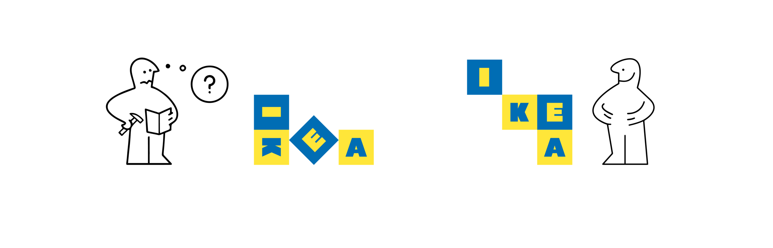
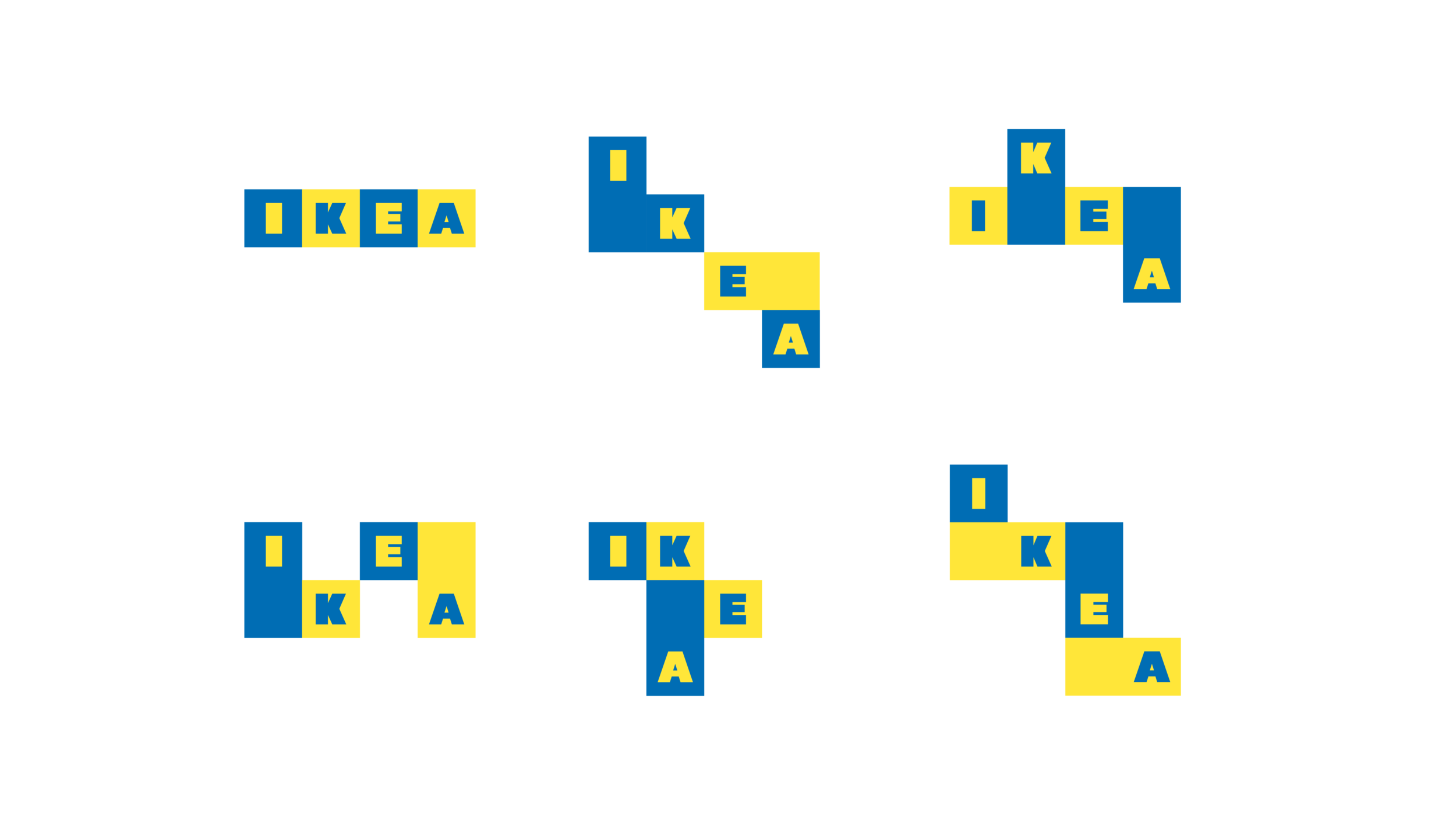
Our objective was to better connect the logo with IKEA’s brand DNA. We began by looking at the best parts, namely colour and bold type. We refined the type to more closely align with the original, cleaner, Futura Press; which we felt is more suited to the IKEA product aesthetic. Through colour, the logo remains instantly identifiable.
Compartmentalising each of the four letters into a modular, stackable identity system creates a playful, flexible brand device - connecting brand, products and customers.