
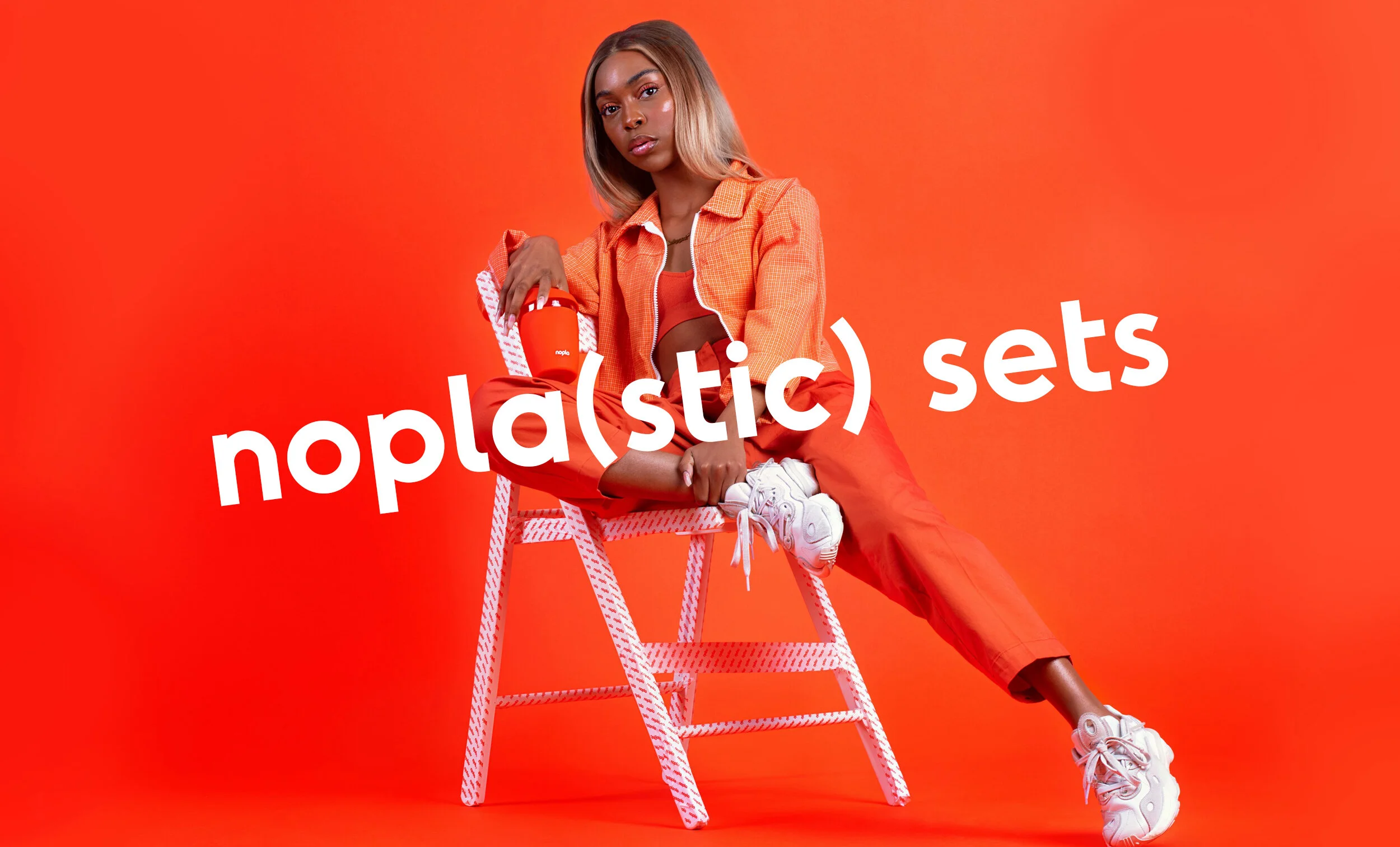
Nopla: Orange is the new green for this non-plastic essentials startup.

Working closely with founders Francesco and Mia we created a brand which is on a mission to help us all find a way to a nopla(stic) future. www.nopla.store
Project summary
Visual identity
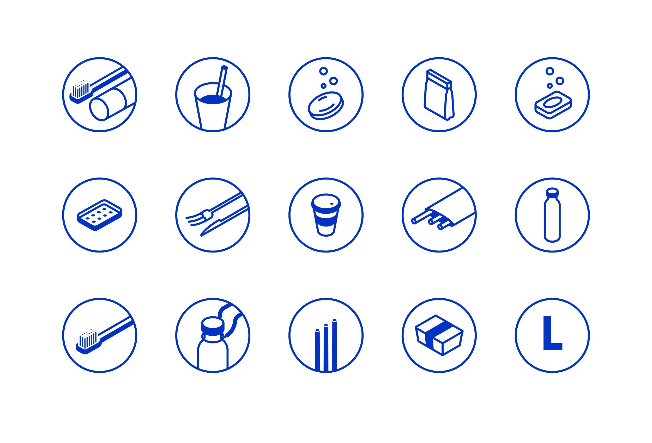
Iconography
Brand guidelines
Packaging
Print
Approach
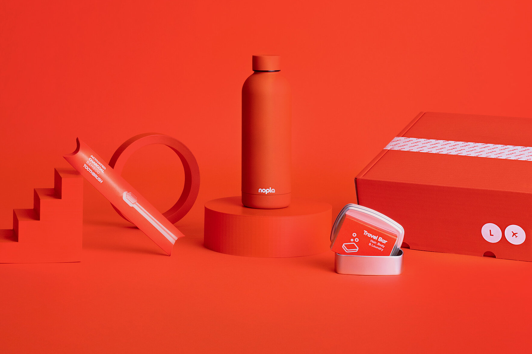
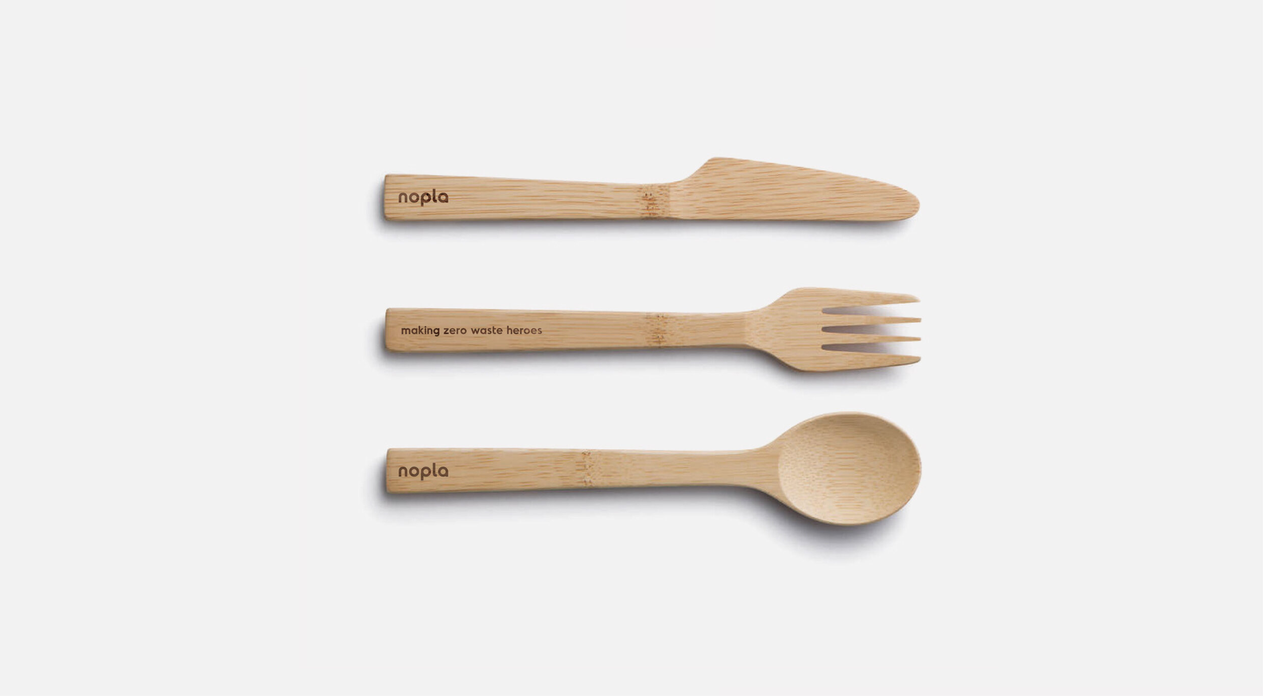
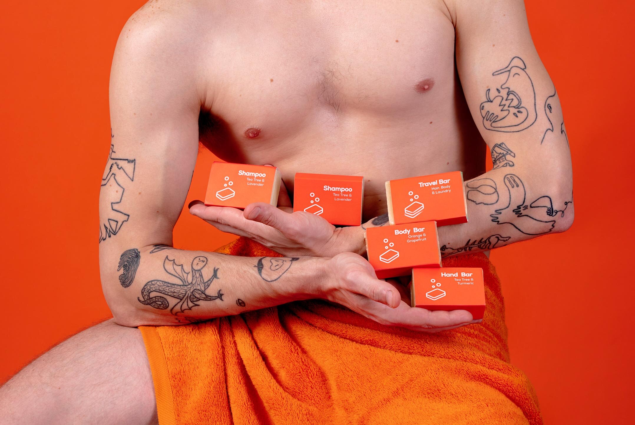
Nopla is a startup on a mission. With the plastic crisis affecting our lifestyles and environment: whether it’s plastic littering the streets, microplastics found in your food or particles polluting the air you breathe–it affects us all. Nopla wants to help everyone to make a difference by designing and curating a series of everyday products and essentials kits for the home to better to help both people and the planet.
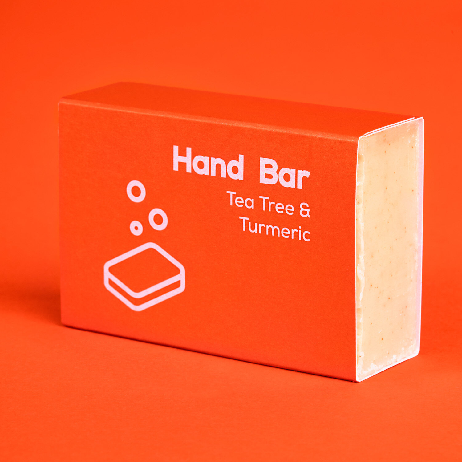
One of the key aspects of creating the Nopla brand was that the founders Francesco’s and Mia were keen to make sure it was bold, vibrant and fresh. An impactful orange and blue palette were chosen to counter the often bland, neutral tones that a lot of established environmentally friendly brands seem to choose–deliberately dispelling the myth that environmentally friendly products can't be colourful.
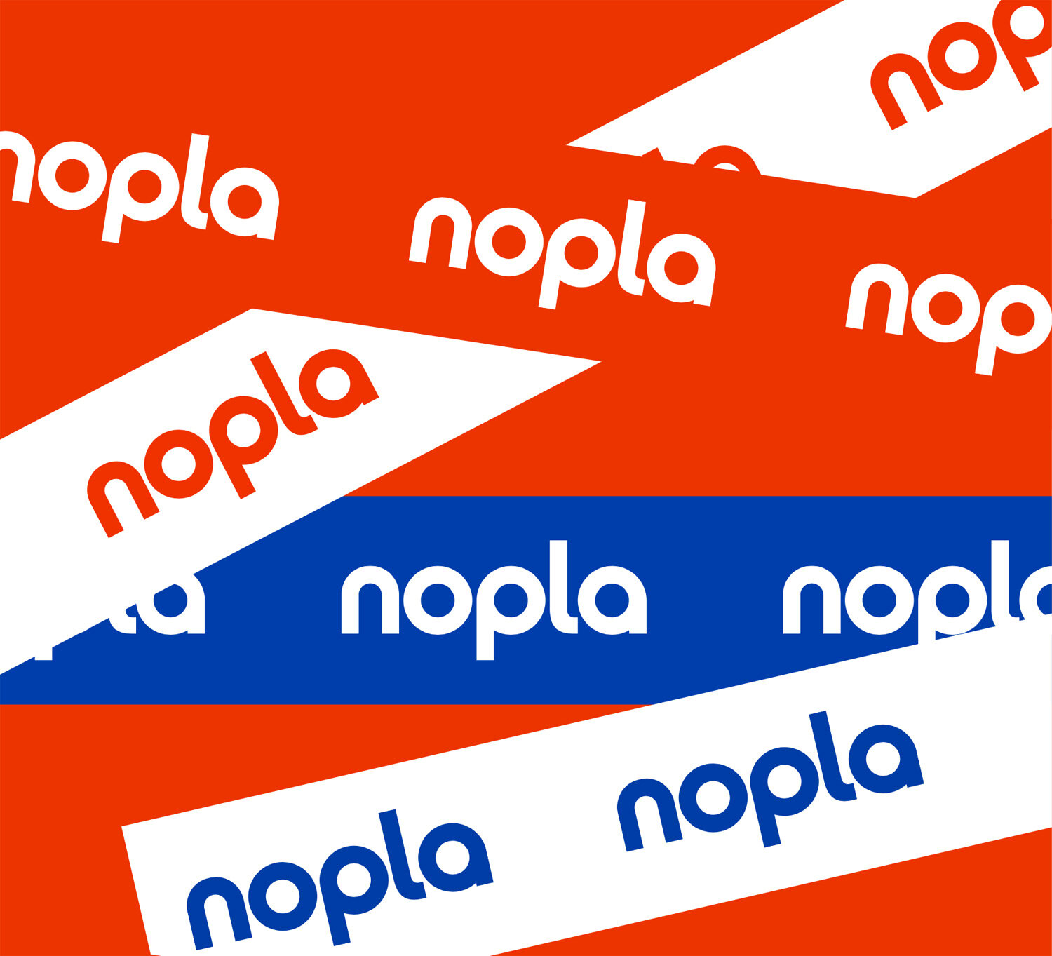
The Nopla brand was created to be accessible and flexible as it had to be applied in lots of different ways to so many products. A simple, customised wordmark in lowercase was created and using the repetition of the circular forms contained within the letters, we created a series of circular icons which are used for products and packaging. We paired this with a playful brand language designed to appeal to the target market with messaging such as ‘orange is the new green’ and ‘making zero waste heroes’. We also applied the brand to outer box designs, paper packing tape and brand guidelines.


nopla.store design & build by Bauholz


Project team
Photography: Greta Kalvaityte
Site design & build: Bauholz
Client comments
With Freytag Anderson we were able to create a truly unique brand identity. We successfully transformed what it means to be sustainable. We turned our nopla(stic) movement into something fun, colourful and vibrant. Orange is the New Green.
Mia Morrison
Co-Founder / Creative Director