
Woven:
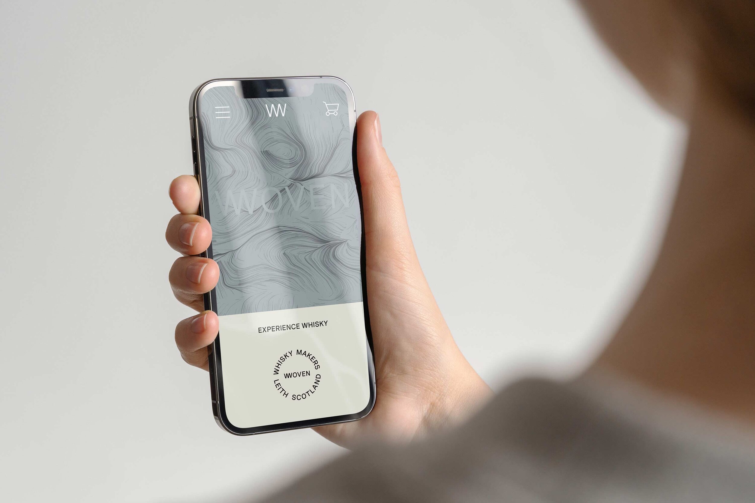
Experience Whisky

A new brand to challenge and disrupt the blended whisky space. Woven celebrates the ‘blend’ and just what it can be. wovenwhisky.com
Project summary
Brand positioning
Naming
Brand voice
Visual Identity
Packaging
Social branding
Website
Generative Art
Merchandise
Print design
Approach
Pete and Duncan approached us to help them create a new brand to challenge and disrupt the blended whisky space. They wanted to celebrate the ‘blend’ and just what it can (and should) be. Their goal is to make whisky more accessible, targeting the next generation of whisky drinkers with a modern set of values: inquisitive, daring and passionate about the brands they choose to engage with.
Over the past few decades, the whisky industry has done a great job of creating the image of whisky. Establishing what drinkers should look for in a whisky, what they should taste, what words they should use to describe their experience. This has resulted in a saturated and homogenised brand landscape where things tend to look and sound much the same. Whilst this isn’t necessarily a bad thing, it has provided the opportunity to create something different.
We started by exploring the idea of ‘experience’ and how each person has their own unique way of experiencing the world. Instead of telling people what to taste and look for in a whisky, we wanted to find a more accessible and inclusive way of connecting with their audience. From this we developed the positioning ‘Experience Whisky’.
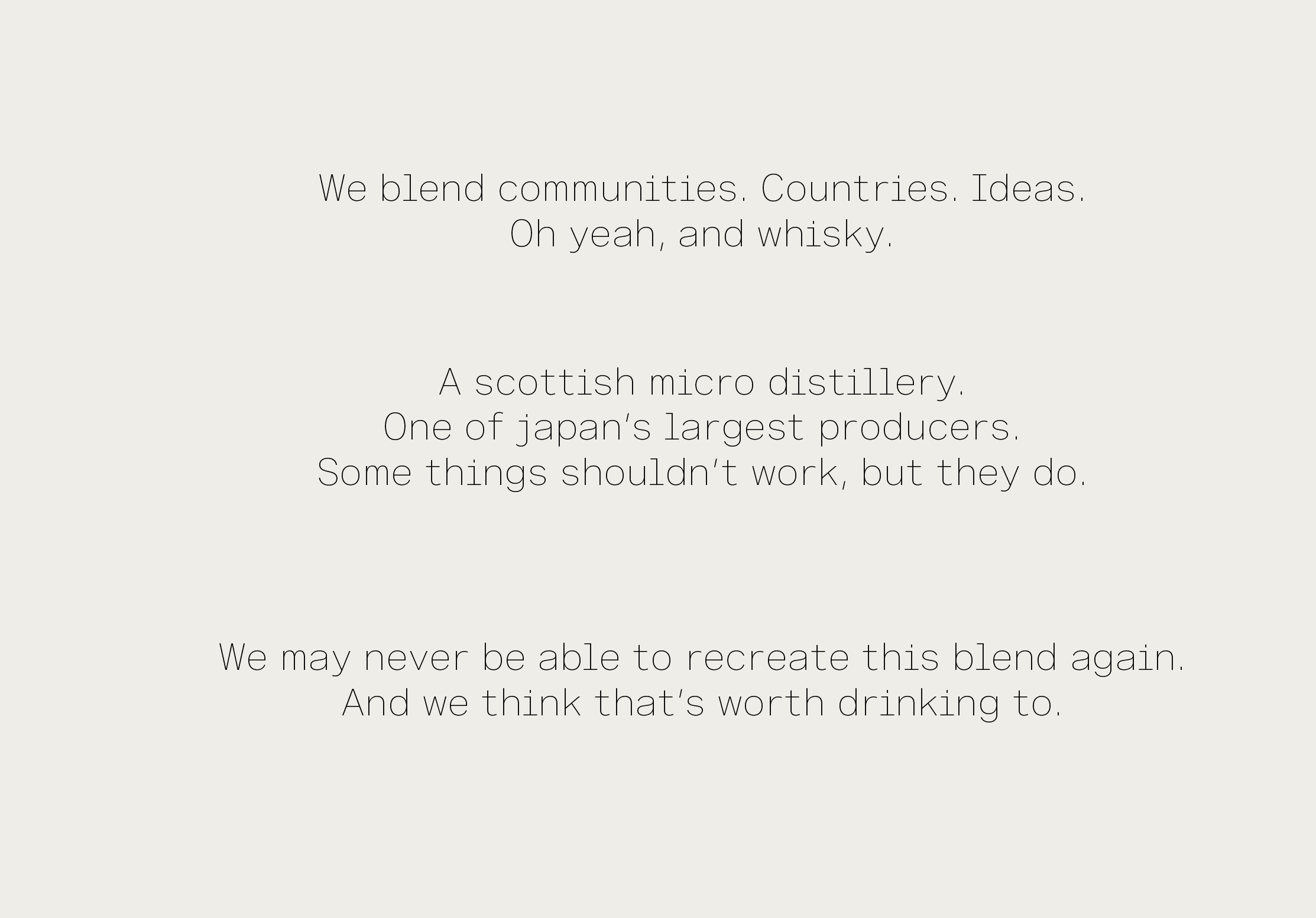
Coming up with the right name for the business was a challenge. For us the word ‘Blend’ was the starting point and central to the creative brief. We liked the way the word represents a way a life or, perhaps more accurately, an approach to life. Things coming together to create something bigger, richer, better. We came up with ‘Woven’ as it communicates a sense of warmth and intimacy. It also hints at process and community which are both important to the founders. Alongside the name we also developed a distinct brand voice - straightforward, inclusive and real, it should be immediately apparent that Woven is something different and exciting.
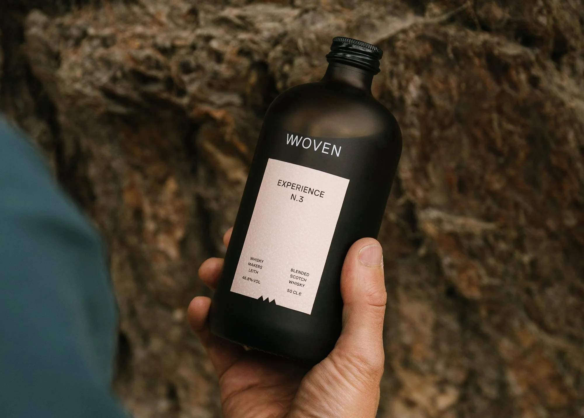
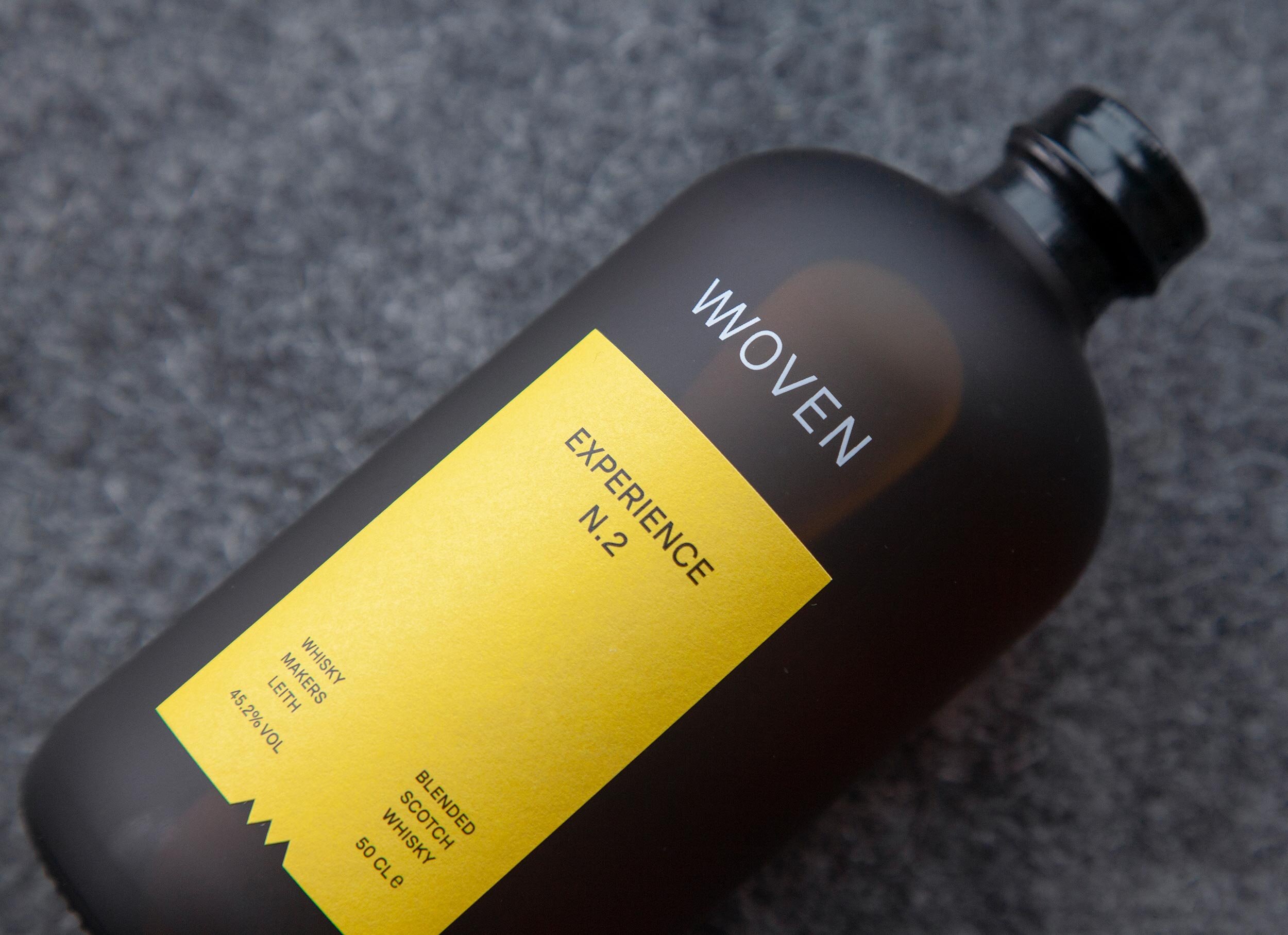
To further challenge perceptions we designed a bottle that looked very different from what might be expected. The frosted brown apothecary style glass is tactile, warm and covetable - it’s something you want to touch and hold. Each blend experience is released in chronological order. The single colour front label is intentionally minimal, designed to create a sense of curiosity and anticipation.
To introduce individual blends, drive social engagement and reinforce the brand positioning ‘Experience Whisky’, we developed the ‘Visual Blender’. We were intrigued by the question ‘What does flavour look like?’ and worked with generative artist Loïc Schwaller to develop a custom interface that would allow us to create dynamic flavour profile visualisations by inputting data unique to each blend.


VISUAL BLENDING
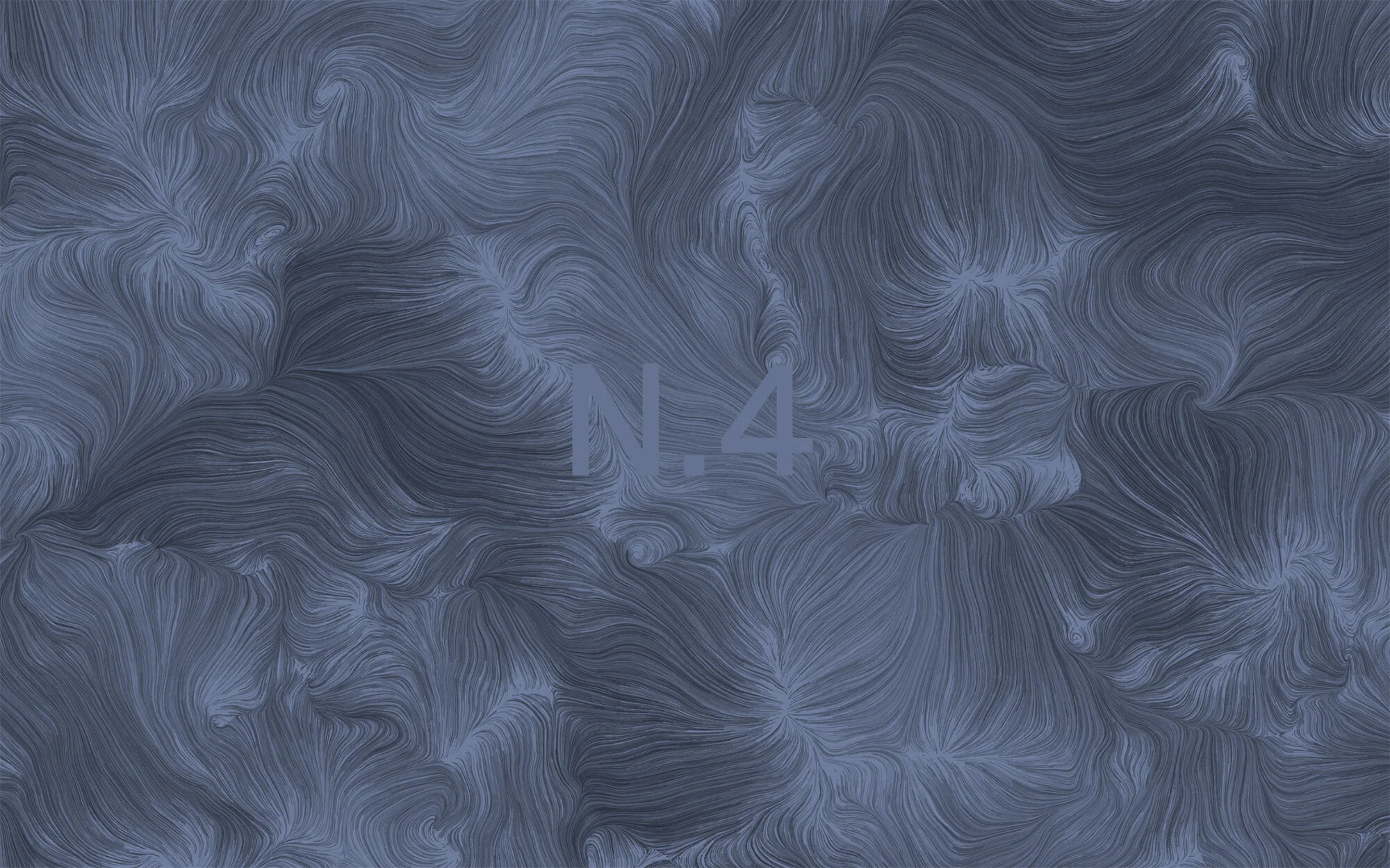
GENERATIVE ART FLAVOUR VISUALISATIONS
ANATOMY OF THE WHISKY


BRAND VOICE


Project team
Brand Strategy / Copywriting: Iain Nevill
Visualisations: Where Giants Roam
Photography: Murray Orr
Generative Art: Loïc Schwaller
Client comments
Freytag Anderson took on a brief that had been a decade in the making and to cut a long story short, nailed it. After taking the time to deep dive into our "why" and purpose, Freytag Anderson delivered a brand world that was on one hand so true to what we wanted to create but on the other hand the purest distillation of the myriad of ideas and stimuli that we'd briefed. The result is a name, brand world, and product aesthetic that holds us to account and demands that we stay true to what it is that we set out to do in a way perfectly represents the ethos we desire to embody, and behaviours we want to exhibit. Across a huge variety of touch-points, Freytag Anderson have delivered a no compromise but hugely practical ecosystem of assets that layer together to make something so much bigger than the sum of it's parts.
Freytag Anderson are superstars without the ego. They're trusted advisors, valued brand partners of the highest order and we're grateful to have been able to collaborate with them on this project. Having worked with countless agencies in my career, I am happy to recommend Freytag Anderson in the strongest possible terms; they are quite simply, the masters of their craft.
Duncan McRae
Co-Founder