

Prodigi:
Rebranding the world’s leading print on demand platform.
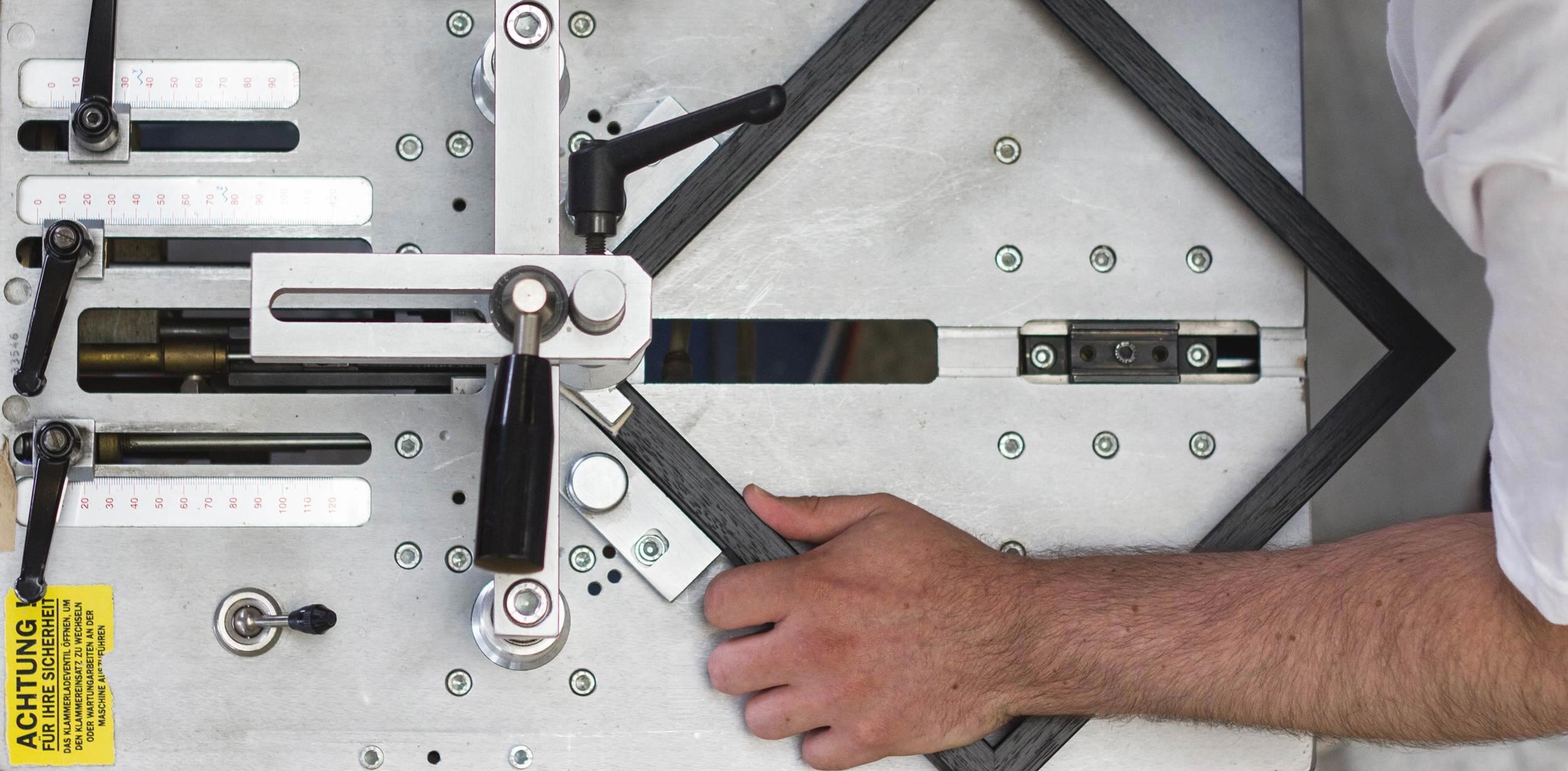
Prodigi are a global print-on-demand business. They sought to consolidate their operations under a simple yet powerful brand identity which delivers meaning and purpose. prodigi.com
Project summary
Visual identity
Print
Packaging Design
Art direction
Website
Approach
Prodigi operate in a cluttered and confusing digital marketplace. Their tech and creative clients are very visually literate and need to feel they’re getting something special. Not just another bland utilitarian service.
We wanted Prodigi’s new identity to communicate clarity, creativity and a sense of playfulness. We started by exploring the relationship between pixel and paper. How the mechanics of paper, such as folding and layering, might inform a wider visual language. We distilled our experiments into a simple yet powerful graphic mark which can be manifested in print and screen, either in isolation, or combined with additional creative content.


Client comments
“We’ve been working with the team at Freytag Anderson to consolidate our current brand identity and to help us better communicate what we do as a company. It was important to us that our identity felt like more than just another bland, online digital service. The team at Freytag Anderson have an ideas based approach to design. Their visual experimentation led us to a simple yet powerful visual identity combining the notion of paper and pixel, both of which are central to our operations.”
James Old
Founder & CEO